 This was really the end of an era, folks. Westerns were a dying breed and this issue represents one of the final nails in the coffin. While the Rawhide Kid had certainly had a good run, the final 6 or 7 years were all reprints. According to the Statement of Ownership, it has been selling at a clip of 89,000 per issue. Could you imagine those numbers today? This is a decent issue, reprinting a story from Rawhide Kid #99, one of the last original stories of the series. It is just a typical 'Johnny Clay trying to get a legitimate job' tale, which never seems to work out. He ends up with two broken hands. The good news is that the back-up here is a nice Outlaw Kid story with gorgeous Doug Wildey art. It's great to see Dave Cockrum doing a western cover. Man, could that guy ever draw! Overall, it is a pretty bittersweet farewell.
Thursday, April 15, 2010
Exit Stage Left: Rawhide Kid #151
This was really the end of an era, folks. Westerns were a dying breed and this issue represents one of the final nails in the coffin. While the Rawhide Kid had certainly had a good run, the final 6 or 7 years were all reprints. According to the Statement of Ownership, it has been selling at a clip of 89,000 per issue. Could you imagine those numbers today? This is a decent issue, reprinting a story from Rawhide Kid #99, one of the last original stories of the series. It is just a typical 'Johnny Clay trying to get a legitimate job' tale, which never seems to work out. He ends up with two broken hands. The good news is that the back-up here is a nice Outlaw Kid story with gorgeous Doug Wildey art. It's great to see Dave Cockrum doing a western cover. Man, could that guy ever draw! Overall, it is a pretty bittersweet farewell.
Wednesday, April 14, 2010
You've Been Warned: Marvel Premiere #43
 Marvel Premiere #43 features Paladin, the rather intriguing mercenary who first popped up in Daredevil. When I re-read this book not too long ago, I forgot to check the credits, but it didn't take me long to realize that it was written by Don McGregor, the man who still thought he was being paid by the word. What a mess! If today's generation ever wants to point to excess exposition in the Bronze Age, this is the perfect piece of evidence. The dialogue, especially that spouted by the villain, is clunky beyond belief. Now, I normally loooooove Tom Sutton's artwork, but it just doesn't work here. Perhaps it's the color job or just the shoddy production, but everything gets blurred together and it is extremely difficult to follow. In the right hands, this could have worked out as a decent story. As it stands, I can only recommend that you avoid it at all costs.
Tuesday, April 13, 2010
Gil Kane Cover of the Month: Supernatural Thrillers #9
 Kane produced many well regarded superhero covers for Marvel during the 1970s, but many of my favourites were in other genres. The cover to Supernatural Thrillers #9 is no exception. It is a beautifully designed cover, with some nice attention to detail. We've had a bit of a discussion about Al Milgrom's inking over at Comic Book Resources, but I think he does a great job here - adding some depth to the image. I like Kane serving as his own inker, but he sometimes went with too fine a line in the 70s. Of course, this type of half-submerged cover is all about the lighting effects, and I'm not sure who colored this cover, but they did a terrific job. As it stands, Kane's half-submerged cover is right up there with the best of Bill Everett and Lee Elias. Like many Marvel covers, this one is hurt by the captions.
 Monday, April 12, 2010
Hidden Gems: Secret Origins #29
 I largely ignored this series the first time around. That was dumb. I guess I thought it was merely the rehashing of origins, and I would have claimed at the time to know just about everything there was to know about the pre-Crisis DCU. Little did I know that there are actually jam packed with solid stories and add plenty of new layers to most origin stories. This one is no exception. The Atom story is fine. It tries to make sense of all of the nuttiness to which Ray Palmer had been subjected during the 80s. It's for Atom completists only (I belong to that group). Much better is the Mr. America/Americommando story by Roy Thomas. Thomas shows the evolution of the character and it really serves to inform James Robinson's Golden Age miniseries. It is a nice little piece in that puzzle. The real gem hidden deep in this book, however, is a 3 page Red (Ma Hunkel) Tornado story, written and illustrated by Sheldon Mayer. As far as I can determine, this was the last work done by Mayer for DC so it certainly represents the end of an era.
 Friday, April 09, 2010
Trade Marks: Teen Angst
 This is a terrific collection of pre-Code romance stories put out by Malibu in 1990. My good friend Mickey was kind enough to send this little treasure my way. It's a black and white collection of stories originally published by Avon and St. John. The reproduction is decent and the introductions are solid, even if no new ground is truly covered. Many of the stories have artwork by Matt Baker and Everett Raymond Kinstler, and those gents certainly know how to make a romance story leap off the page. I was also very impressed with the artwork of Rafael Astarita, a nearly forgotten Golden Age great. Among the highlights is Jinx Girl, about a woman whose lovers have the habit of dying just before they are about to propose. Conversely, A Dangerous Woman, is about a gold digger who marries an elderly man who simply refuses to die. Make Believe Marriage involves a woman who pretends to be married in order to land a job. Even though her lie is revealed, things end in a wonderfully neat and tidy manner. Didn't they always? This is a great sampler of pre-Code romance and I highly recommend grabbing a copy if you can find it. Trade Mark: B+
Thursday, April 08, 2010
Quick Book Reviews
 The Third Man – Graham Greene
The film certainly has a very memorable screenplay, so I thought it was worth checking out the source material. We have a bit of a quirk here, as the screenplay pre-dated the book – but Greene certainly handled the transition well. Over the years, I’ve run pretty hot and cold with Greene’s work. Some of it is very engaging, while others leave me with a real sense of detachment. To be frank, The Power and the Glory falls into the latter category. Much like the movie, Harry Lime is a spirit moving throughout the story. What I liked about the book is that, while Rollo Martins is certainly interested in getting to the bottom of the mystery, he remains even more morally ambiguous than he did in the movie.
 Being There – Jerzy Kozinski
Again, I’ve seen the movie but never got around to reading this book (novella?). The only other Kozinski book I’ve read is The Painted Bird, and this one is certainly less intense. I liked it, but it really does feel like a minor work. I can understand how people really enjoyed the satirical look at Washington back in 1971, but it comes off as a bit dated these days. All in all, it seems a bit thin and I actually think things were better fleshed out in Ashby’s film.
 Yiddish Policeman’s Union – Michael Chabon
Get ready for a little comic book geek heresy. I quite preferred this book to Kavalier & Clay. Like his earlier work, Chabon does an incredible job of establishing a setting. With this book, however, rather than worrying about historical detail – he allows himself to create his own universe. By the end of the book, it is hard to believe that Sitka, Alaska isn’t actually a giant metropolis. To me, K&K meandered a bit too much, and falls apart in the second half. A bit of the same thing occurs in YPU, but Chabon keeps it from unraveling completely and his work developing characters improved immensely as our hero, Meyer Landsman is a wonderfully complex and multi-dimensional character. It is almost as if Chabon was channeling Richler here.
 Run - Anne Patchett
This book came highly recommend by my parents. I was immensely underwhelmed. It is lovely and polite, but it is also unbelievably bland. The plot is relatively simple, and I would be surprised if someone could not correctly guess where it was headed. Patchett makes the mistake of hinting at elements of racism and corruption but never addresses them. Her characters are also very wooden, and this leads to a drama-free dramatic novel. I get the sense the Patchett is trying to say something with this book, but she fell far short.
 Girl With the Dragon Tattoo – Stieg Larsson
While The Third Man is a good book that was commissioned as a screenplay, this feels like a book written with the intention of being optioned for a movie. I have no idea how this one became such a phenomenon. As a mystery, it really isn’t very mysterious. As a thriller, the thrilling moments are few and far between. I felt as it I was treading water, turning page after page. It was overly sensationalistic at times, while coming up short in the suspense department at other times. I also think it is a shame that the title was changed from Men Who Hate Women. This one is certainly about misogyny, if nothing else – I only wish that a bit more substance could have been inserted somewhere into the 800 pages. I won’t be reading the sequels.
Wednesday, April 07, 2010
R.I.P. Henry Scarpelli
 It seems as though we're losing classic comic creators at a dizzying rate these days. I just read that long-time funnybook artist Henry Scarpelli passed away on Sunday at age 79. To be honest, as a child I tended to avoid most teen humour and funny animal books. They also seemed to be around the neighbourhood, because I imagine most parents felt they were a 'safe' choice. I was generally too obsessed with Batman and Daredevil to notice just how much intelligence and artistry went into most of these books. Scarpelli played a large role in those genres, and it is only within the last 10 years or so that I've come to appreciate how much skill he brought to the table. I'm still not totally on board the good ship Archie, but I have become more and more familiar with Scarpelli's work for various licensed properties at Dell and Charlton, and his contributions to a handful of DC titles. For my money, his work with Steve Skeated on the Abbott & Costello series for Charlton was simply fantastic, and I'm only sorry that I've come to learn this so late in life. Rest in Peace Mr. Scarpelli.
Tuesday, April 06, 2010
Highlighting House Ads: DC in 1966
Even without the Go-Go Checks, 1966 would have been a pretty far out year at DC. This was the year they tried to get super hip with their house ads, and often tried to incorporate the letters 'D' and 'C' into the ads. This a perfect example of the kind of house ad you'd see in summer of 1966. Half page, and on-third page ads were everywhere throughout your average comic. This was a far cry from 10 years earlier when you'd be hard pressed to find a single house ad in a book. A little competition from Stand and the gang will do that to you. Of course, there is plenty of truth in advertising here -as those 80-Page Giants were plenty entertainin'.

Monday, April 05, 2010
Steve Ditko Cover of the Week: Micronauts Annual #2
 Ditko would seem to be a perfect fit for the Micronauts. He always manages to infuse his action sequences with a good deal of energy and fluidity, and to my eyes that should would work great in Inner Space. For the most part, it does actually work well. This is an action heavy issue and Ditko helps to keep things bouncing along, particularly in the gladiator inspired area battles involving Bug and Acroyear. My only real problem is this cover. The figures seem incredible stiff, and the poses are quite awkward. It is especially weak when compared to the terrific covers Michael Golden was producing for the ongoing series. This 'work for hire' era was not Ditko's finest moment, but this issue is quite decent but the cover leaves a lot to be desired.
Thursday, April 01, 2010

Easter Island Covers
The mysterious statues of Easter Island have been great source material for comic book covers. Although it was first visited by a Dutch explorer on an Easter Sunday nearly 300 years ago, the island didn't really become comic book cover fodder until the late 50s.
 Let's start with one of my favourites; Jack Kirby's terrific cover to House of Mystery #85 (April, 1959). I love the concept that the status actually have bodies hidden underneath the ground. That being said, these guys have disproportionately sized heads, and I imagine that they would be quite tippy. Truth be told, these statues are not actually on Easter Island, but rather a previously unknown island somewhat unimaginatively named Giant Island. The explorers in question do, however, compared these statues to those on Easter Island. It's a fun story, highlighted by a scene in which one statute holds a blue whale over its head. The story was reprinted in DC Special #11.
 Just a few months later, Marvel would enlist Kirby to provide the cover and cover story to Tales to Astonish #6 (September, 1959). Personally, I find the colour scheme here to be quite dull as the DC 'grey' really has more pop than the darker Marvel 'grey'. There's just no contrast here - everything, right down to the water, looks grey. It 1973, this cover was recoloured and recycled for Where Monsters Dwell #24. The Easter Island statues are pretty much the perfect thing for Kirby to draw - almost as if they were created just for him.
 The Duck clan has travelled the world several times over, so it should come as no surprised that they had an adventure on Easter Island. Uncle Scrooge Adventures #3 (January, 1988). The GCD tells me that this cover is by Daan Jippes, and I'll have to trust their word on that because I am far from a Duckspert. I really like this one, as the blacks help to establish a very ominous atmosphere. I'm a bit surprised that the Ducks didn't get to Easter Island during Carl Barks' day, but maybe someone can correct me if I am wrong.
 Here's a really fun cover. Strange Adventures #16 (January, 1952) features a cover by the great Gil Kane and it is notable because it features a superhero-life costume on the strange alien. This happened from time to time at DC in the 50s, and you could see that aspects of some of these costumes were eventually used for Silver Age characters, but I don't think this one ever reappeared. I am not sure if the statues are actually red-faced in the interior story, but it certainly makes them jump off the cover. Edmond Hamilton wrote this story, and I wonder if he ever wrote a pulp tale with an Easter Island theme.
 I'll leave off with an odd one. Right in the middle of the excellent run on this series by Bill Mantlo and Sal Buscema, the Hulk (and the Absorbing Man) found themselves on Easter Island. For this monumental event (or is it just a weird one?), we got a cover by none other than Frank Miller for Incredible Hulk #261 (April, 1981). For my money, Miller draws just about the weirdest looking Hulk I've ever seen, and that's saying quite a lot. I'm not entirely sure that any of the statues are near enough to each other to accommodate Absorbie's pose, but I'll allow for a bit of artistic license.
 Let's start with one of my favourites; Jack Kirby's terrific cover to House of Mystery #85 (April, 1959). I love the concept that the status actually have bodies hidden underneath the ground. That being said, these guys have disproportionately sized heads, and I imagine that they would be quite tippy. Truth be told, these statues are not actually on Easter Island, but rather a previously unknown island somewhat unimaginatively named Giant Island. The explorers in question do, however, compared these statues to those on Easter Island. It's a fun story, highlighted by a scene in which one statute holds a blue whale over its head. The story was reprinted in DC Special #11.
  Just a few months later, Marvel would enlist Kirby to provide the cover and cover story to Tales to Astonish #6 (September, 1959). Personally, I find the colour scheme here to be quite dull as the DC 'grey' really has more pop than the darker Marvel 'grey'. There's just no contrast here - everything, right down to the water, looks grey. It 1973, this cover was recoloured and recycled for Where Monsters Dwell #24. The Easter Island statues are pretty much the perfect thing for Kirby to draw - almost as if they were created just for him.
 The Duck clan has travelled the world several times over, so it should come as no surprised that they had an adventure on Easter Island. Uncle Scrooge Adventures #3 (January, 1988). The GCD tells me that this cover is by Daan Jippes, and I'll have to trust their word on that because I am far from a Duckspert. I really like this one, as the blacks help to establish a very ominous atmosphere. I'm a bit surprised that the Ducks didn't get to Easter Island during Carl Barks' day, but maybe someone can correct me if I am wrong.
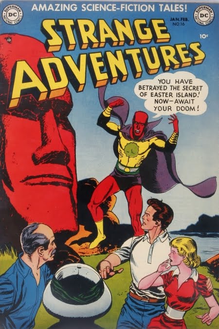 Here's a really fun cover. Strange Adventures #16 (January, 1952) features a cover by the great Gil Kane and it is notable because it features a superhero-life costume on the strange alien. This happened from time to time at DC in the 50s, and you could see that aspects of some of these costumes were eventually used for Silver Age characters, but I don't think this one ever reappeared. I am not sure if the statues are actually red-faced in the interior story, but it certainly makes them jump off the cover. Edmond Hamilton wrote this story, and I wonder if he ever wrote a pulp tale with an Easter Island theme.
 I'll leave off with an odd one. Right in the middle of the excellent run on this series by Bill Mantlo and Sal Buscema, the Hulk (and the Absorbing Man) found themselves on Easter Island. For this monumental event (or is it just a weird one?), we got a cover by none other than Frank Miller for Incredible Hulk #261 (April, 1981). For my money, Miller draws just about the weirdest looking Hulk I've ever seen, and that's saying quite a lot. I'm not entirely sure that any of the statues are near enough to each other to accommodate Absorbie's pose, but I'll allow for a bit of artistic license.
 Wednesday, March 31, 2010
Memoirs of a Bronze Age Baby: Mighty World of Marvel #2
 In the summer of 1983, my family took a 3 week vacation to England & Wales. I was nearly 11 years old that summer, and pretty much near the peak of my childhood interest in comic books (although Return of the Jedi was also taking up a lot of the geeky portion of my brain). Somewhere during that trip, my parents bought me this magazine-sized comic. Although I'd seen the Editions Heritage books in Quebec before, this was my first real taste of an international variant. I was an Avengers and Vision nut at the time, so this was a perfect fit. Although the title proclaims Everybody Dies!, I have a feeling this contained the Kitty Fights Alone story - but I can't find any real details about the contents of this mag, and I lost mine over 20 years ago. That trip was also my one and only visit to the legendary Forbidden Planet store in London (I had seen their awesome ad in the Overstreet Guide). I had a bit of money put aside for a special purchase. They had nice copies of both New Teen Titans #1 and Iron Man #1 for the exact same price. I don't want to tell you which one I chose.
Tuesday, March 30, 2010
Heckling the Heckler
 I don't get it. I just don't get it. I know that this series is very well regarded as a piece of superhero satire, but I just don't get it. For starters, I tend to run pretty hot and cold on the Bierbaums. To me, much of their work is too dense. Here, the jokes are often obvious or simply miss their mark. The 3X3 panel approach hampers Keith Giffen's ability to tell a story. Many times, I simply could not tell what was going on. There was next to no character development and I was often simply lost. I first read this nearly 10 years ago, and was quite puzzled. With a bit more comic book mileage under my wheels, I decided to tackle the 6 issues last week and it still did not work for me. Comedy is tough, and satire can be even tougher. I ran into the trap of admiring what Giffen and the Bierbaums were trying to accomplish while never truly enjoying it. Take Heckler #4, for example. The underlying theme here is a tip of the hat to the Road Runner/Wile E. Coyote rivalry. It was clever at first, but then got stuck in a loop a became less and less clever as the issue wore on. I'll commend their effort, but the final product left a lot to be desired.
Monday, March 29, 2010
Thank You Mr. Giordano
 I woke up Saturday morning to hear that Dick Giordano had passed away. I had a very busy weekend with the family, but kept thinking about Giordano and his vast contributions to the comic book industry. When I got finally a few moments to myself last evening, I sat down with a couple of Sarge Steel, the 'Action Heroes' issue of Comic Book Artist and my copy of the Greatest Batman Stories Ever Told. I spent the rest of the evening marvelling at Giordano's skill and, perhaps more importantly, his love of comic books. He was terrific both as penciller and inker, and I've often thought that he was terribly underappreciated as a cover artist (working for Charlton will have that effect). His storytelling in "There Is No Hope in Crime Alley" is phenomenal, as he and Denny O'Neil collaborated on the best one-page Batman origin ever. For all of his artistic talent, his people skills were even greater. He certainly made a profound impact in his editorial role at both Charlton in the 60s and DC in the 80s. His 'Meanwhile...' column served as a looking glass into the inner workings of DC, and his replies to letters while at Charlton showed that he had a tremendous amount of respect for comic book fan. Dick Giordano was one of a kind, and we were fortunate that he chose to work in comic books.
Friday, March 26, 2010
Single Issue Hall of Fame: The Phantom #74
 Is this the greatest American Phantom comic book story every published? Probably. I'd even go so far as to say it is one of the best standalone comic books of the 1970s. I know that my good friend Tim in Idaho ranks this as his all-time favourite comic book, as he's read quite a few. It is an incredible story written and beautifully illustrated by the late, great Don Newton. I don't think I've ever seen Newton produce better work and it holds up quite well on Charlton's sub par paper. I think it was pretty cool that Newton decided to do a story with some real guts in the months leading up to the Bicentennial celebrations. In this tale, the Phantom takes his fight against the slave trade all the way to Philadelphia where he has a pretty interesting chat with Benjamin Franklin. Sadly, this was the final issue of the Charlton series, but at least they went out on top. The Newton Phantom issues are consistently great and are, therefore, pretty pricey to track down. I'd love it if someone would acquire a license and put out of trade of the Newton years as well as the Skeates/Aparo years, but that's another entry altogether.
Subscribe to:
Posts (Atom)


