
Thursday, April 26, 2012
Gil Kane Cover of the Month: Captain America #215

Wednesday, April 11, 2012
Memoirs of a Bronze Age Baby: Grimm's Ghost Stories #50
 I would have been about 6 and a half years old when this comic book hit spinner racks. Coincidentally, that's also exactly the same age as my own son now. Of course, he's Harry Potter 24 hours a day and has only a fraction of the interest in funnybooks that I did as a kid. That's fine, as I don't want to push it. I assume that once he sees that mountain of boxes in our basement, he'll find a way to spend rainy afternoons. I'm not sure this type of ghost story book would be up his alley, but my 4-year old daughter would love it, as she's much more into witches and ghosts. I'm 99% sure I got this book in a 3-pack bag, and I still have two of the three books (I believe the other two were a Turok and a Mighty Mouse) from back then. I always enjoyed these books, and still do to this day. In fact, I think I have a soft spot for artists like Frank Bolle because they played such a subtle, yet important role in my childhood. I hope my kids have a similar experience.
Friday, January 27, 2012
Exit Stage Left: Sweethearts #137
 Like many Charlton series, Sweethearts has a long and strange history. This was one of many Fawcett titles taken over by Charlton in early 1954. Did you know that Sweethearts can trace its roots all the way back to Captain Midnight #1 (September, 1942)? The series came to Charlton with issue #122. Of course, since we're dealing with Charlton it makes perfect sense that they renumbered the series with the second Charlton issue as issue #22. Yup, there really was something in the water in Derby. Anyhow, this series kept chugging along for another two decades before signing off with this issue. The series actually maintained a decent level of quality throughout the years and this one is another, slightly better than average romance book. I love how they managed to incorporate another of Charlton's go-to subgenres (Hot Rods) into this book. Anyone know who drew the cover? The inking is really quite nice.
Wednesday, January 18, 2012
Add It to My Want List: Upcoming Phantom Collections
 Ok, I will be the first to admit that I do not stay on top of what 'new' releases are on the way, so this may be very stale news. I was on Amazon's website, and it mentioned that I may be interested in some keen looking Phantom collections. Might I? It looks as the stories from the Gold Key years, the King years and the Charlton years are all being reprinted and released next month. I own over half of the Charlton books, but it would be sooo nice to have them all in one place so I can see the crazy variations in artists from Aparo to Sherwood to Newton. Kudos for Hermes Press for putting these together - I just hope it's not some sort of hoax. On a related topic, I am still trying to figure out the ID of Norm di Pluhm as Steve Skeates apparently said it wasn't him.
Friday, December 23, 2011
Reprint This! Hot Wheels
 Like so many titles I have previously discussed in this column, this one is likely stuck in licensing hell. DC got into the TV and Toy tie-ins during this era (see Captain Action and Bomba), but this one was a real standout. Hot Rod comics had been around forever, and were on the decline by the time the first issue of Hot Wheels hit newsstands. Still, it was a valuable property and DC knew exactly which creative teams to bring on board. Alex Toth had done plenty of work for Drag Cartoons and had a way with cars. They also made sure that they got some fantastic Adams/Giordano covers to help pump sales. Jack Keller and Ric Estrada, both strong auto-artists, also made contributions. Apparently, none of this worked as the series was short-lived. They can be found, but it may take you a while. I have been buying these off and on for years and I am still a two issues short of a complete run. I would love to have it all in one volume so that I could revel in the amazing artwork.
Thursday, December 22, 2011
Trade Marks: Asterios Polyp
 It is incredible to see what creators like David Mazzucchelli are trying to do with the art form. This feels like something a Saul Bellow or Richard Ford would create if they knew how to draw (my apologies to those gents if they do, indeed, draw well). This is the story of a rudderless man, reflecting on his life, or lack thereof. The balance between struggle between intellectual superiority and happiness is front and centre. Our hero is morally ambiguous at best, but we identify with him enough that the pathos is palpable. I must admit that there is a depth here that I may have missed. If I had more background in architecture and/or Greek mythology I may have gotten more out of it. In any case, the layers make it ripe for a revisit. My main complaint is at there is a certain emotional flatness to the characters in the story, although it may all be tied to the downside of apathy. It is a beautifully designed book, but I was quite happy to find it for half price. Solid stuff - just short of a masterpiece. Trade Mark: A-
Monday, December 19, 2011
Steve Ditko Cover of the Week: Daughters of Time
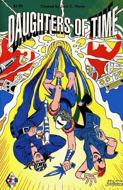 This, my friends, might be the most obscure Steve Ditko cover that I every discuss in this space. Daughters of Time was published in 1991 by 3-D Zone comics. Never heard of it? Neither had I until recently. I love Ditko and I love Kurt Schaffenberger, but this cover just does not work for me. I think it is a combination of the disorienting layout and the garish colours. As far I can recall, this is the only time these two artists collaborated. I'd love know if they worked together elsewhere, as they would be an interesting team. The GCD tells me that it's 100% Schaffenberger on the inside. $3.95 was pretty pricey back then, and I wonder if this book lived up to its price tag. The hunt begins, my curiosity cannot be sated until I own it.
Friday, December 16, 2011
Hidden Gems: Metal Men #21
 Truth be told, this is actually a below average Metal Men book. We all know that their adventures tend to be quite silly, but silly can be fun. This is mostly dull. The main problem is that the Plastic Perils are not all that perilous. Before you think that I actually meant to slot this into the 'You've Been Warned' category, let me tell you why it is worth owning. What makes this issue special is that it features some brief, yet charming cameos by some of the DCU's biggest stars. Batman & Robin, Wonder Woman and the Flash all make appearances, declaring their admiration for the Metal Men and wishing they all had more time to hang out. This is a good one for fans of crossovers, as it serves as a good example of the powers that be at DC trying to shoehorn big name characters into lesser known titles.
 Thursday, December 01, 2011
SOTI - M.I.A.
 Dear friends and SOTI regulars. I am not dead. I have not lost my internet connection and I certainly have not lost my love of blogging. The company for whom I work has been involved in a major transaction and I (being the idiot who thought law school was a good idea) have been buried in a mountain of paperwork and an endless stream of emails since mid-August. I will return soon.
 Wednesday, October 26, 2011
Trade Marks: Marvel - 1985
 I picked this up knowing nothing about it, but have since learned that it was surrounded by a decent amount of hype. I do like Mark Millar's work, but I feel as though he can sometimes get tripped up by his own cleverness. We are deep in high concept, meta textual land here, as some sort of portal opens between the 'real' world and the Marvel Universe. The good news is that when it works, it is splendid. The brutality of the villains is on full display, and the sense of impending danger is really well portrayed. What does not work, however, are the characterizations of the 'real' people. The father and son protagonists are poorly fleshed out and the relationships are only dealt with at a superficial level. The artwork is strong at times, but the storytelling gets quite muddles in certain sequences. All in all, it is a gimmick book that falls far short of its intended target. Trade Mark: C
Wednesday, October 05, 2011
Gil Kane Cover of the Month: Island of Doctor Moreau
 I love the fact that Marvel saw fit to use Kane as the go-to cover guy during the 1970s. This particular cover has all of the elements necessary to get a fanboy's attention. The floating heads of the Beast Men look terrific, and his character design for the creatures is spot on. Of course, Michael York looks a bit more buff, and Lancaster's Moreau even more menacing but I'll chalk that up to artistic license. It's a very powerful cover and, although I like Larry Hama's artwork, I really wish Gil Kane had be tasked with the interior pencils. If you want to hear me chat about the movie, check out my guest appearance on the Gentleman's Guide to Midnite Cinema: http://ggtmc.libsyn.com/episode-148-beasts-and-guns
Wednesday, September 28, 2011
Single Issue Hall of Fame: Detective Comics #483
 As we all know, Dollar Comics are awesome. This one, however, is one of the awesomest. First of all, there's a gorgeous two-panel cover by Jose Garcia-Lopez cover. The lead story, "The Curse of Crime Alley" is very strong, with artwork by the team of Don Newton and Dan Adkins. In fact, I like the artwork so much, that I have a page of it hanging in a frame on a wall in my TV room. There are a few more treats between the covers, including a Ditko drawn Demon story and a real Oddball classic entitled "Gotham's Great Kangaroo Race", with artwork by Dick Dillin and Frank McLaughlin. It must have been one of Dillin's final jobs. It is fitting that such the man who pencilled many a crazy Blackhawk and JLA story still got selected for the nutty stuff. Grab this book - you will love it.
Tuesday, September 20, 2011
I Loves Me Some: Star Wars - Heir to the Empire
 I grew up a Star Wars fan, but never really followed much of the expanded universe stuff. I did read the three Timothy Zahn books back in the 90s, when I was an undergrad and looking for a fun distraction. Now that my children are showing a real interested in the Star Wars films, I've been keeping my eye out for affordable comics books to give them when they reach the appropriate age. I had never read any of the comic adaptations of the Zahn trilogy, so I was happy to find these at less than a buck a book. The story remains quite strong, and I think Mike Baron's script gives it room to breathe. There are a lot of characters and subplots to fit in, and I think he did an admirable job. What really blew my mind, though, was the artwork by Olivier Vatine and Fred Blanchard. It is highly stylish and incredibly dynamic. Good stuff all around. Dark Horse was obviously very concerned into getting a high quality product into the hands of highly demanding readers.
Thursday, September 15, 2011
Charlton Notebook: Charlie Chan #7
 The mid-50s was an interesting time at Charlton. They had acquired a series of titles from various publishers and suddenly became something of a publishing empire. One of the 'new' titles at Charlton was Charlie Chan, which arrived via Prize/Crestwood, hence the Simon & Kirby house look to the book. This was the second Charlton issue of this short-lived series, and the final one to feature leftover inventory from Prize/Crestwood. I'm not entirely sure who did the artwork here, as I know that everyone from Dick Briefer to Manny Stallman worked on this series, and it has that over whelming Prize feel to it. The stories are fun, and pretty innovative. It is really too bad that the funnybook world has moved away from the mystery genre. Have a look at the Number One son, Jimmy's face on the cover (which is taken from an inside semi-splash) here. Doesn't it have a Gil Kane look to it?
Tuesday, September 13, 2011
Add It To My Want List: Lone Ranger #24
 Some of you may know that I am a pretty big Dell's Lone Ranger series. I started collecting issues with painted covers (blue shirts only please - had to draw the line somewhere) and have slowly amassed more than 50 of them. I have always known that Gold Key had a Lone Ranger series in the 70s, but always assumed that they were reprints. I scanned the GCD cover gallery and noticed some new images and I can only guess that these must have some new material. Even if they don't, those are still new covers so I want them. Badly. I will start my collection of these new covers with issue #24 because I absolutely adore the hot air balloon scene. I'm going to It is completely incongruous with a traditional Lone Ranger tale, but also perfectly in step with the fun tone of the series. I can only guess that George Wilson was responsible for this one, as he was the master of the painted cover at Gold Key during this period.
Subscribe to:
Posts (Atom)


