Alex Toth has died.
I guess like all things, it was inevitable. Still, there seemed to be so much life left in the man, his thoughts so sharp, his opinions so strong, that it looked like immortality might actually be in the cards.
In some ways it’s odd that such a giant in the comic book field, is best known by the general public much more for his contribution to the animation world. Today’s ‘Adult Swim’ crowd might not even realize that the likes of Space Ghost and Harvey Birdman were created by one of the best damned artists to work in the funnybook business.
Toth has always been seen as the ‘Cartoonist’s Cartoonist’. He is well respected within the creator community and has a very strong fan base. All of this for a man who bounced around from project to project, and company to company – never really having a definitive character, title or even genre for that matter.
I really don’t know all that much about the technical aspects of putting a comic book story together. My eyes tend to glaze over a bit when people get into a deep conversation about inking with a brush or spotting blacks. Deep down I really just prefer to rely on my immediate emotional response to the artwork. Perhaps more than any other artist, Alex Toth felt that there was a right way and a wrong way to tell a comic book story. He looked to the likes of Noel Sickles and Milt Caniff for inspiration. Early in his career, Toth was mentored by Sheldon Mayer, who encouraged him to master all aspects of comic book storytelling. Toth always felt that the job of the artist was to tell the story, and that anything else (such as what he called the ‘Kubert money-shot’) simply muddied the waters.
People will often look at a piece of Toth art, and talk about how it is brilliant because of the fact that he decided to leave out unnecessary details. I prefer to say that he took the time to contemplate precisely what needed to go into the page, and used only those elements. His use of silhouettes, his sound effects, the cut-off close-ups: all of these things gave a certain quite dynamism to the page and enabled him to catch the reader’s eye without relying on the double page splash. Simply put, Toth had his own way of telling a story and, more often than not, it was the right way.
Monday, May 29, 2006
The Passing of Alex Toth - Part 2
Let’s take a trip down memory lane.
Alex Toth got his start in the mid-40s, including some work for Famous Funnies Publications. A good way to see some early (and cheap) Toth art is to track down a copy of Heroic Comics. This is a very strange (by today’s standards) series depicting real life acts of heroism, usually in a two or three page story with a rotating cast of artists including Toth, Sid Greene and Fred Guardineer. It’s a pretty silly title, and Toth’s artwork may not be instantly recognizable, but they are a fun example of Golden Age goodness and can usually be found on eBay for under $5.
A year or so later, Toth began doing work for DC/National – including stints on the Green Lantern strip and All-Star Comics. Funnily enough, while Toth’s artwork was quite strong, it didn’t really seem full energized until the introduction of Streak the Wonderdog in Green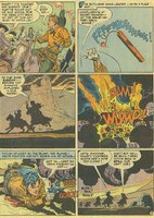 Lantern. This was perhaps the first indication that Toth strengths might be away from the cape and tights crowd. Anyone who knows me knows that I am a big western fan, and for my money the high watermark of the genre was Toth’s run on Johnny Thunder in All-American Western. I have been picking these up whenever I see them for over a decade, and I am one issue (#121) shy of putting together a complete run. I’ll never understand why DC hasn’t given this strip the ‘Archives’ treatment, but anyone looking for inexpensive samples should track down a copy of Showcase #72 or the Johnny Thunder reprint title from the early 70s. Toth worked on other DC western titles, such as Jimmy Wakely and Dale Evans, but it is apparent that he preferred working on Bob Kanigher’s Johnny Thunder stories than any others at that time. The page I’ve included is a good example of Toth’s stylish approach to western storytelling.
Toth’s work really diversified in the 50s, as he worked for several companies in a wide range of genres. Standard/Nedor/Better Comics is nearly forgotten today, but this company brought us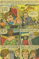 the likes of Black Terror and Xela airbrush covers in the 40s. By the 50s, under the Standard imprint, they published a variety on non-superhero titles including ultra violent war titles such as Joe Yank, schlocky horror titles such as The Unseen and plenty of old fashioned romance books. These books can be tough to find, but a little effort may be rewarded by strong artwork by Toth, Mike Sekowsky and Ross Andru. Romance comics are all but ignored by many of today’s comic book fans, but they once represent a vital part of the industry. A good story is a good story, and Toth brought a real freshness to the romance genre. The example I’ve included here is the first page to a short 3-page story from Today’s Romance #6 from 1952. I’d love to see an inexpensive collection of Toth’s romance work, but that’s not likely to happen.
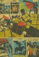 Later in the decade, Toth began doing quite a bit of work for Dell. This included many movie adaptations for the Four Color title. Although I stated earlier that Toth is not truly associated with one character or series, he comes closest with Zorro. These adaptations of the Disney TV show allowed Toth to explore Old California and instill a good mixture of action and humour. Perhaps more than any other Toth work, these stories are a feast for the eyes as the reader is treated to an incredible sense of movement. These stories were reprinted in black and white (with Toth contributing to the new tones) first by Eclipse (I belive) and then later by Image. For anyone interested in getting a glimpse of what makes Toth so great, I strong recommend these reprints, as the black and white is a vast improvement on the colour versions.
Alex Toth got his start in the mid-40s, including some work for Famous Funnies Publications. A good way to see some early (and cheap) Toth art is to track down a copy of Heroic Comics. This is a very strange (by today’s standards) series depicting real life acts of heroism, usually in a two or three page story with a rotating cast of artists including Toth, Sid Greene and Fred Guardineer. It’s a pretty silly title, and Toth’s artwork may not be instantly recognizable, but they are a fun example of Golden Age goodness and can usually be found on eBay for under $5.
A year or so later, Toth began doing work for DC/National – including stints on the Green Lantern strip and All-Star Comics. Funnily enough, while Toth’s artwork was quite strong, it didn’t really seem full energized until the introduction of Streak the Wonderdog in Green
 Lantern. This was perhaps the first indication that Toth strengths might be away from the cape and tights crowd. Anyone who knows me knows that I am a big western fan, and for my money the high watermark of the genre was Toth’s run on Johnny Thunder in All-American Western. I have been picking these up whenever I see them for over a decade, and I am one issue (#121) shy of putting together a complete run. I’ll never understand why DC hasn’t given this strip the ‘Archives’ treatment, but anyone looking for inexpensive samples should track down a copy of Showcase #72 or the Johnny Thunder reprint title from the early 70s. Toth worked on other DC western titles, such as Jimmy Wakely and Dale Evans, but it is apparent that he preferred working on Bob Kanigher’s Johnny Thunder stories than any others at that time. The page I’ve included is a good example of Toth’s stylish approach to western storytelling.
Toth’s work really diversified in the 50s, as he worked for several companies in a wide range of genres. Standard/Nedor/Better Comics is nearly forgotten today, but this company brought us
 the likes of Black Terror and Xela airbrush covers in the 40s. By the 50s, under the Standard imprint, they published a variety on non-superhero titles including ultra violent war titles such as Joe Yank, schlocky horror titles such as The Unseen and plenty of old fashioned romance books. These books can be tough to find, but a little effort may be rewarded by strong artwork by Toth, Mike Sekowsky and Ross Andru. Romance comics are all but ignored by many of today’s comic book fans, but they once represent a vital part of the industry. A good story is a good story, and Toth brought a real freshness to the romance genre. The example I’ve included here is the first page to a short 3-page story from Today’s Romance #6 from 1952. I’d love to see an inexpensive collection of Toth’s romance work, but that’s not likely to happen.
 Later in the decade, Toth began doing quite a bit of work for Dell. This included many movie adaptations for the Four Color title. Although I stated earlier that Toth is not truly associated with one character or series, he comes closest with Zorro. These adaptations of the Disney TV show allowed Toth to explore Old California and instill a good mixture of action and humour. Perhaps more than any other Toth work, these stories are a feast for the eyes as the reader is treated to an incredible sense of movement. These stories were reprinted in black and white (with Toth contributing to the new tones) first by Eclipse (I belive) and then later by Image. For anyone interested in getting a glimpse of what makes Toth so great, I strong recommend these reprints, as the black and white is a vast improvement on the colour versions.
The Passing of Alex Toth - Part 3
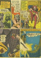 By the 60s, Toth was doing less comic book work and much more animation work, but was still making significant contributions, especially to DC. Eclipso is another in a long line of truly odd heroes introduced by DC in the 60s, perhaps trying to keep up with the House of Ideas. The strange concept of the villain as hero was made even stranger by Toth’s artwork on the strip – which veered away from superhero norms of the time. I’ve included a page here from House of Secrets #65 to give a sense of just how unique Toth’s approach to superhero comics was at the time. Another good example is the oft-reprinted Brave and Bold #53, featuring one of the better non-Batman team-ups. Toth also contributed several stories to DC’s line of mystery titles in the early part of the decade. Later in the 60s, he did some strong work for some DC romance titles as well as Hot Wheels.
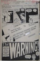 Stan Lee was well known for asking many DC artists to work for him (many under pseudonyms) in the 60s as the Marvel line was expanding. Artists such as John Romita and Gene Colan were given almost a fresh start at Marvel, and yet somehow Alex Toth made only minimal contributions. The best known example is X-Men #12, which has been reprinted several times, but the reader won’t get a true sense of what Toth could do, as he was working from Kirby layouts, who had a very different approach from Toth. A better example is the story ‘The Warning’, a very strong back-up story from Rawhide Kid #46. I own the title page from this story, and it is incredibly different from anything published from Marvel at that time. I can only assume that Stan Lee felt that Toth was simply a poor fit for his books, and didn’t offer any more work. Outside of DC and Marvel, other strong colour work from Toth can be found in some in Dell/Gold Key titles such as Frogmen and Twilight Zone. These can be found for a fraction of the price of a DC or Marvel book from the same era.
The Passing of Alex Toth - Part 4
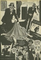 Jim Warren’s black and white magazine line gave many creators a sense of artistic freedom that they were denied by mainstream publishers. Some of Toth’s strongest work ever can be found in the Warren magazine. Blazing Combat is still one of, if not the, greatest war comics ever, and Toth’s contribution were integral to the series. These have become unbelievably pricey in recent years, and I’d love to see the stories reprinted in an affordable format. Toth’s work for the horror books was just as strong, and much of his work through the 70s would be in the horror genre. The page I’ve included here is from a mid-70s story and it demonstrates the dynamic layouts imagined by Toth, as the action all but leaps off the page. I've been trying to track down a copy of Creepy #139 for a few years now, as it is an all-Toth issue but I've had no luck.
 Warren was not the only place to find good horror stories, as DC’s revamped horror titles, edited by Joe Orlando tried to tap into the market revitalized by Jim Warren. Like many anthologies, the stories can be hit and miss, but Alex Toth made several contributions and they are all quite strong. Jack Oleck should be a much bigger name in the comic book work as he wrote some of the best horror stories ever, and he and Toth made for a formidable team. “The Devil’s Doorway” is only of the best DC horror stories ever published, and it’s rather shocking ending stands in stark contrast to the pap produced by DC just a decade earlier. The recently published Showcase Presents House of Mystery features a handful of Toth drawn stories including “The Devil’s Doorway” and is well worth checking out, as this price is right, they look good in black and white and these books can be tough to find.
It could be argued that Toth’s strongest work is from the 70s. Some of these stories, such as
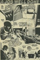 “White Devil…Yellow Devil” from Star Spangled Stories #164 and “Death Flies the Haunteds Sky” from Detective Comics #442, are very well known and have been reprinted several times. For my money, DC’s best story from the entire decade (that’s saying a lot!) is a back-up from Adventure Comics #431. The story entitled ‘Is a Snerl Human’ harkens back to an earlier time in comic book history when readers were often treated to 8-page morality plays. The story, written by Toth mentor Sheldon Mayer is comic book perfection, and it’s a crime that DC has not seen fit to reprint it in one form or another. As I’ve mentioned in an earlier blog entry, one of the hidden gems of the 70s is Atlas-Seaboard’s Thrilling Adventure Stories #2. The black and white magazine can be tough to track down, but the reader is rewarded with art by Walk Simonson, John Severin, Russ Heath and a very interesting story drawn by Toth.
In recent years, Alex Toth’s contributions to the comic book work have been limited to the odd pin-up or cover, but his ongoing contributions via memoirs to magazines such as Comic Book Artists and Alter Ego have provided a much needed window to the industry’s past. His passing means an end to these columns, and the silencing of a very important voice.
Rest in Peace, Alex – you’ve earned it.
Friday, May 26, 2006
Whither the Try-Out Book? - Part One
Last month, at the Paradise Toronto Comicon, I snagged a big stack of books from bargain bins. Among these were 10 or so copies of Marvel Premiere from the late 70s and early 80s. I have had some books from this title previously (the Liberty Legion, Ant-Man and Doctor Who issues), and I was happy to pick up some more. To me, this is a great way to introduce a new or revamped character. In particular, I always liked the Scott Lang Ant-Man books, along with his appearance in Marvel Team-Up.
Both Brave and the Bold and Showcase served DC well as a launching pad for new ideas in the 60s. Sure, it was a bit hit and miss and for every Justice League of America, there was a B’wana Beast, but it’s impossible to deny how much goodness came out of these two titles.
In the 60s, Marvel was able to (and forced to, due to distribution limits) introduce many of its successful new characters in already established titles, but these were not true try out books. By the 70s, however, Marvel decided the time had come to launch titles whose primary goal was to test how well readers would respond to new or revamped characters. By the mid-70s, Marvel had two titles dedicated to the premise. Ostensibly, Marvel Spotlight was supposed to give existing characters (Nick Fury, Deathlok) another kick at the can, whereas Marvel Premiere was to introduce brand new characters and concepts. Of course, there were exceptions to this rule, but I’ve read that was the plan.
Personally, I think try-outs books were a great way to test the waters, but I can’t see how they’d work in today’s Direct Market. In the 70s, a kid was likely to spot an issue and buy it off the shelves, but today’s marketplace does not really allow impulse buying. That’s too bad – but c’est la vie. Here’s a quick look at some of my recent reads
Marvel Premiere #32: Monark Starstalker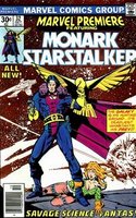
This is a decent little space western, with Chaykin transferring a Jonah Hex-like character to the deepest regions of space. It’s not bad stuff, better than most of the high concept stuff produced by both Marvel and DC. Chaykin’s artwork gets a it muddied in the printing process, but there was some real promise here – as Chaykin’s demonstrates that he is a unique creator (With hindsight, we know he covers much of this ground repeatedly, but judged on its own merits, it’s a good read.
Marvel Premiere #33 & #34: Mark of Kane
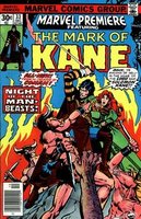 Roy Thomas and Chaykin team up for a pretty pedestrian adaptation of a Robert E Howard story. The Solomon Kane stories in the b&w magazines were superior to this one, but that’s not saying much. Kane is a one note character, and absolutist philosophy makes one feel like they are reading a Steve Ditko comic. There’s not much characterization here, as the second half of the first issue is one prolonged swordfight. The second issue takes us on ridiculous manhunt to Africa - with some typical 70s voodoo and gorilla justice thrown into the mix. I guess Howard fans must have been happy to see their Puritanical hero in colour, but I wasn’t feeling it. I guess not every pulp hero truly deserves his own title in the 70s.
Marvel Premiere #54: Caleb Hammer
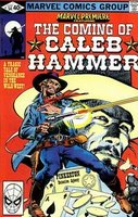 This time, Marvel doesn’t even bother putting Jonah Hex in space. This smells, looks and feels like a Jonah Hex comic book (right down to the Clint Eastwood-like appearance and Tony DeZuniga inks), but that’s not necessarily a bad thing. After years of publishing only reprinted western tales, Marvel reenters the western genre (as it is on its death bed) with this Peter Gillis about a Pinkerton with a tragic past. This art by the Gene Day/DeZuniga team is perfect for the story and in a different era, Caleb Hammer might have had a future. Sadly, this was 1980 and six shooters were out of vogue. There is one major flaw with this book – as occurs with most Marvel books. We learn Hammer’s full back story in this single issue. Part of the charm of Jonah Hex was his mysterious background, and analyzing the various hints that were dropped regarding his Confederate jacket and his scar.
That’s it for now – I’ll be back with a look at some more Marvel Premiere books in the near future.
Both Brave and the Bold and Showcase served DC well as a launching pad for new ideas in the 60s. Sure, it was a bit hit and miss and for every Justice League of America, there was a B’wana Beast, but it’s impossible to deny how much goodness came out of these two titles.
In the 60s, Marvel was able to (and forced to, due to distribution limits) introduce many of its successful new characters in already established titles, but these were not true try out books. By the 70s, however, Marvel decided the time had come to launch titles whose primary goal was to test how well readers would respond to new or revamped characters. By the mid-70s, Marvel had two titles dedicated to the premise. Ostensibly, Marvel Spotlight was supposed to give existing characters (Nick Fury, Deathlok) another kick at the can, whereas Marvel Premiere was to introduce brand new characters and concepts. Of course, there were exceptions to this rule, but I’ve read that was the plan.
Personally, I think try-outs books were a great way to test the waters, but I can’t see how they’d work in today’s Direct Market. In the 70s, a kid was likely to spot an issue and buy it off the shelves, but today’s marketplace does not really allow impulse buying. That’s too bad – but c’est la vie. Here’s a quick look at some of my recent reads
Marvel Premiere #32: Monark Starstalker

This is a decent little space western, with Chaykin transferring a Jonah Hex-like character to the deepest regions of space. It’s not bad stuff, better than most of the high concept stuff produced by both Marvel and DC. Chaykin’s artwork gets a it muddied in the printing process, but there was some real promise here – as Chaykin’s demonstrates that he is a unique creator (With hindsight, we know he covers much of this ground repeatedly, but judged on its own merits, it’s a good read.
Marvel Premiere #33 & #34: Mark of Kane
 Roy Thomas and Chaykin team up for a pretty pedestrian adaptation of a Robert E Howard story. The Solomon Kane stories in the b&w magazines were superior to this one, but that’s not saying much. Kane is a one note character, and absolutist philosophy makes one feel like they are reading a Steve Ditko comic. There’s not much characterization here, as the second half of the first issue is one prolonged swordfight. The second issue takes us on ridiculous manhunt to Africa - with some typical 70s voodoo and gorilla justice thrown into the mix. I guess Howard fans must have been happy to see their Puritanical hero in colour, but I wasn’t feeling it. I guess not every pulp hero truly deserves his own title in the 70s.
Marvel Premiere #54: Caleb Hammer
 This time, Marvel doesn’t even bother putting Jonah Hex in space. This smells, looks and feels like a Jonah Hex comic book (right down to the Clint Eastwood-like appearance and Tony DeZuniga inks), but that’s not necessarily a bad thing. After years of publishing only reprinted western tales, Marvel reenters the western genre (as it is on its death bed) with this Peter Gillis about a Pinkerton with a tragic past. This art by the Gene Day/DeZuniga team is perfect for the story and in a different era, Caleb Hammer might have had a future. Sadly, this was 1980 and six shooters were out of vogue. There is one major flaw with this book – as occurs with most Marvel books. We learn Hammer’s full back story in this single issue. Part of the charm of Jonah Hex was his mysterious background, and analyzing the various hints that were dropped regarding his Confederate jacket and his scar.
That’s it for now – I’ll be back with a look at some more Marvel Premiere books in the near future.
Friday, May 12, 2006
An Offer You Can Refuse
The Godfather - Part III
I was given the trilogy on DVD a couple of years ago, and although my wife and I watched parts I & II right away, we were a bit Corleoned out and waited to watch this one. It caused quite a bit of controversy back in the day, as it people's expectations were so high that it was almost bound to fail. Sofia Coppola took most of the heat, and
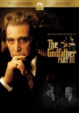 As a standalone film - it's not bad. It's not great - but it would have been seen as a decent, elegantly shot mob family film. In comparison to Parts I and II, it comes across as disjointed, meandering and poorly written.
Sofia Coppola seemed to take the brunt of critisims on her shoulders - and although she is certainly not Olivier, the movie has enough flaws that they can be shared amongst the principals. Her Dad is mostly to blame as he is the architect for this slowly paced, highly repetitive story. The first two films were tightly woven, with a feeling a menace in almost every scene. So many scened in Part III make the viewer feel as though they are eavedropping on a boring family conversation.
While Ms. Coppola may not be much of an actress, she can hardly be faulted as she was just starting out. What excused does Eli Wallach have for his almost laughable job as Don Altobello. Honestly, my wife and I were giggling during the scene in which he chases after Joe Mantegna after he's left the boardroom. Trying to compete with him ham for ham are the rest of the principals, most notably Talia Shire - whose role was augmented here with fewer and fewer of the Corleone siblings still alive. It's a big shift from Brando, Caan, Duvall and Cazale to Wallach, Shire and Mantegna.
All of that being said, there as some decent moments - even if some of them (the opera 'excecutions across Europe' scene) echo scenes from the earlier films - but nothing really brings it all together. The found the entire Vatican business deals angle is really convoluted, and I used to work as an M&A lawyer!
I really wanted to like this film, as I don't mind being contrarian. I certainly didn't hate it, but I am really glad I didn't watch it immediately after the first two films, as I really think the flaws would have jumped out even more.
I was given the trilogy on DVD a couple of years ago, and although my wife and I watched parts I & II right away, we were a bit Corleoned out and waited to watch this one. It caused quite a bit of controversy back in the day, as it people's expectations were so high that it was almost bound to fail. Sofia Coppola took most of the heat, and
 As a standalone film - it's not bad. It's not great - but it would have been seen as a decent, elegantly shot mob family film. In comparison to Parts I and II, it comes across as disjointed, meandering and poorly written.
Sofia Coppola seemed to take the brunt of critisims on her shoulders - and although she is certainly not Olivier, the movie has enough flaws that they can be shared amongst the principals. Her Dad is mostly to blame as he is the architect for this slowly paced, highly repetitive story. The first two films were tightly woven, with a feeling a menace in almost every scene. So many scened in Part III make the viewer feel as though they are eavedropping on a boring family conversation.
While Ms. Coppola may not be much of an actress, she can hardly be faulted as she was just starting out. What excused does Eli Wallach have for his almost laughable job as Don Altobello. Honestly, my wife and I were giggling during the scene in which he chases after Joe Mantegna after he's left the boardroom. Trying to compete with him ham for ham are the rest of the principals, most notably Talia Shire - whose role was augmented here with fewer and fewer of the Corleone siblings still alive. It's a big shift from Brando, Caan, Duvall and Cazale to Wallach, Shire and Mantegna.
All of that being said, there as some decent moments - even if some of them (the opera 'excecutions across Europe' scene) echo scenes from the earlier films - but nothing really brings it all together. The found the entire Vatican business deals angle is really convoluted, and I used to work as an M&A lawyer!
I really wanted to like this film, as I don't mind being contrarian. I certainly didn't hate it, but I am really glad I didn't watch it immediately after the first two films, as I really think the flaws would have jumped out even more.
Friday, May 05, 2006
My Favourite Places in the World Pt. 2
Copacabana in Montreal
Montreal is full of bars. It’s full of great bars. Anyone who has ever visited the city is likely familiar with the Crescent St. liquor factories, has ordered cheap pitchers at a Peel Pub or has checked out the beautiful people lining up for a trendy place on St. Laurent.
When you spend 4 of your prime drinking years in Montreal like I did, you got through a type of evolution of bars. At the beginning, it is impossible not to be lured in by the siren song of the ‘All you Can Drink’ establishments that seem to have a 400:1 patron to bartender ratio. The next step (after stopping by at least 2 Peel Pubs to collect your free Birthday pitcher) is to check one of the countless bars on St. Laurent. There is something for everyone here – from pick up joints to mosh pits. When it comes down to serious drinking and laughs – you need a place with plenty of seating, cheap drinks and dim lighting to keep the amateurs at bay.
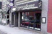 For me, as well as my nearest and dearest friends back then, that place was the Copacabana (which could not have more of an anti-Rio vibe if it tried). If you’ve seen the Oscar-winning short “Ryan”, you may recognize this place. It’s next door to the more popular Café Frappe and underneath the more (in)famous Double Deuce (where they seemed play the original version of ‘Jane Says’ every night). The Copa was the place to go when you’d had enough of the pseudo-hipster scene. As a added bonus, it was only a short 3 block walk back to my apartment on St. Urbain.
A few years ago, I was in Montreal for a conference along with one of my old McGill roommates. We decided to duck out of an afternoon session to walk around and soak up a little Montreal. Not less than a half hour later, we found ourselves sharing a pitcher at the Copa, as happy as pigs in shit. There are some things in life that just feel ‘right’.
Montreal is full of bars. It’s full of great bars. Anyone who has ever visited the city is likely familiar with the Crescent St. liquor factories, has ordered cheap pitchers at a Peel Pub or has checked out the beautiful people lining up for a trendy place on St. Laurent.
When you spend 4 of your prime drinking years in Montreal like I did, you got through a type of evolution of bars. At the beginning, it is impossible not to be lured in by the siren song of the ‘All you Can Drink’ establishments that seem to have a 400:1 patron to bartender ratio. The next step (after stopping by at least 2 Peel Pubs to collect your free Birthday pitcher) is to check one of the countless bars on St. Laurent. There is something for everyone here – from pick up joints to mosh pits. When it comes down to serious drinking and laughs – you need a place with plenty of seating, cheap drinks and dim lighting to keep the amateurs at bay.
 For me, as well as my nearest and dearest friends back then, that place was the Copacabana (which could not have more of an anti-Rio vibe if it tried). If you’ve seen the Oscar-winning short “Ryan”, you may recognize this place. It’s next door to the more popular Café Frappe and underneath the more (in)famous Double Deuce (where they seemed play the original version of ‘Jane Says’ every night). The Copa was the place to go when you’d had enough of the pseudo-hipster scene. As a added bonus, it was only a short 3 block walk back to my apartment on St. Urbain.
A few years ago, I was in Montreal for a conference along with one of my old McGill roommates. We decided to duck out of an afternoon session to walk around and soak up a little Montreal. Not less than a half hour later, we found ourselves sharing a pitcher at the Copa, as happy as pigs in shit. There are some things in life that just feel ‘right’.
Monday, May 01, 2006
Memoirs of a Bronze Age Baby: The Lazarus Affair
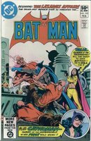 How do I even begin with this one? This story arc than ran in Batman #332 to #335 is rarely brought up in ‘Batman’s Greatest’ type discussions, but I can’t think of anything I’ve re-read as often as The Lazarus Affair. What makes this one so special? How about a little Ra’ Al Ghul? How about Catwoman in her purple Golden Age costume? How about the return of King Farraday? How about the sexual tension that’s about as thick as a 100 Page Super Spectacular?
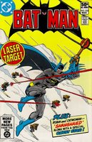 Of course, all of these elements are mixed together into a wonderful mélange by Marv Wolfman and drawn by the awesome team of Irv Novick and Frank McLaughlin. Novick certainly deserves to be counted among the top Batman artists, and I would use his great pencils here as proof. Of course, the Jim Aparo covers are even better! As an added bonus, we are treated to an ongoing solo Catwoman feature drawn by Don ‘Effin Newton! This is Bat-Heaven, folks!
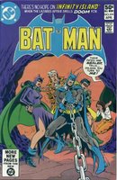 I would have been 8 years old, going on 9 when these issues hit the stands and I was absolutely blown away by the intricate, cliffhanger filled storyline. Issues #333 starts of with a great Bond-like opening, complete with a ski chase (how did Batman click into those binding?). Sure this may not be Frank Miller, but it’s pretty darned engaging all the same. This was my first exposure to Ra’s Al Ghul, and I was really struck by his pure evilness. That scene with the guy escaping on the raft really made an impression on me. I also don’t think that I really understood all of the various relationships in Batman’s life until I saw Talia and Selina getting snippy with each other. I was also intrigued by the obviously strained relationship between Dick and Bruce. King Farraday was also a very mysterious, yet appealing figure and I was vaguely aware of the fact that he was a DC character from way back when.
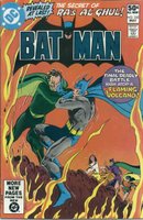 This is all great stuff, with a lot of international intrigue thrown in for good measure. This was one of the first times I can remember experience physical pain while waiting for the next issue to be released. I don’t believe that this story arc has even been collected in a TPB, and that is a real mystery to me. There must certainly be a demand for it, as these issues have been getting pricier and pricier with each passing year. Pick it up if you can, it’s a great read. I still love revisiting the Lazarus Pit every couple of years.
Subscribe to:
Comments (Atom)


