Wednesday, December 27, 2006

Sweet Christmas! Luke Cage in my Stocking!

It seems that my loved ones have finally given up all hope that I will ever grow tired of reading funnybooks. For years I have included various comics on my Christmas Wish List and come out empty handed. This year was a major breakthrough as I hit the mother lode. Here’s what I found under the tree:

Alter Ego Subscription
This came from my 1 year old Logan (his mother helped him out a bit). I’ve been a subscriber for years. Roy Thomas’ fanzine (prozine?) can be a bit hit and miss, but where it’s on, it is a wonderful read. I just don’t want any more issues dedicated to Timely checklists. The Nedor/ACG stuff was great and I always love learning about non-Big Name creators.

Back Issue Subscription
Again from Logan (with Kat’s help). I’ve picked up maybe 5 or 6 issues of Back Issue and have enjoyed it quite a bit. It’s not terribly text heavy, so I find that I fly through a bit faster than I’d like but they hit on some topics that I really enjoy (like the Don Newton stuff recently). I am really looking forward to this showing up at the door every month.

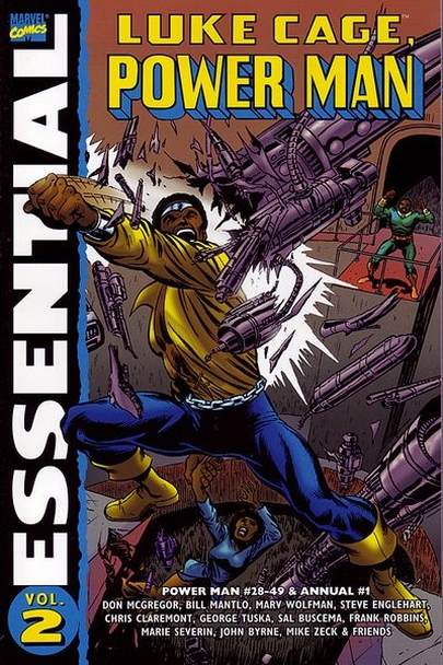
Essential Luke Cage Vol. 2
Nice! My sister and brother-in-law live a few blocks from my favourite comic shop in Toronto (Paradise Comics) and grabbed this one for me hot off the press. I grew up reading Power Man and Iron Fist and although these stories haven’t aged very well, I cannot resist them. Call it camp, call it whatever – just don’t call it boring. I am looking forward to spending some quality time with Mr. C.

Essential Defenders Vol. 2
This also came from my sister and brother-in-law. I like, but didn’t love, Volume 1. My hopes are high for this volume as I know that it contains a good chunk of Gerber. I read Defenders as a kid, but that was mainly after issue #75, so this is all fresh stuff for me. It’s a great way to read a ton of old stuff.

DC Showcase Presents: Challengers of the Unknown
This was a gift from my parents. I have only read a few of the Challs’ early adventures, through the off back issue and various reprints in the 70s. I really like this period of Kirby art so I am anxious to get reading. I read the initial Showcase story and it was pretty good – although I wished they’d took a bit more time to explore the ‘living on borrowed time angle’. Darwyn Cooke was able to improve on it in New Frontier without trampling on what his predecessors had accomplished. The Kirby art looks great in b&w – very interested to explore the issues inked by Wood. I’ve always found Bob Brown to be a bit underappreciated, so I am looking forward to his pencils too.

DC Showcase Presents: The Unknown Soldier
This is from my parents. I own most of the issues in the collection, but really wanted it in this collection. I love the Unknown Soldier, and there’s some great stuff in this one. The first few stories aren’t the greatest as it is mostly just typical DC Silver Age war stuff. Once the writers get a real feel of what a great character the Soldier can be, the series takes off. It’s too bad it cuts off halfway through the Michelini/Talaoc run. I just hope that inspires DC to put out of Volume 2.

DC Showcase Presents: The Haunted Tank
My parents gave me this and then asked me what it was about. You should have seen the look on their face when I explained that it involved a WW2 tank haunted by the ghost of JEB Stuart. Some things are better off being discussed amongst us nerds.

With a one-year old running around the house, I don’t get as much reading time as I’d like, so it will likely take me a while to get through this stuff but it’s great to have a stack of wonderful material sitting on the bookshelf.

Tuesday, December 05, 2006

Charlton Notebook: August 1975

Everybody’s favourite underdog publisher had some ambitious plans for 1975. That summer, Charlton launched 3 new horror titles: Creepy Things, Monster Hunters and Scary Tales. I’ll be looking at first issues of the latter two, both cover dated August, 1975.

Scary Tales #1

Launched amid a relative horror frenzy amongst almost all comic book publisher (heck, even Archie was doing the Red Circle thing), it’s surprising that some of these Charlton titles found any fans at all. This one starts with a fun framing sequence drawn by Joe Staton as we are introduced to Countess Von Bludd. Things go downhill fast, however, as the first story about finding a vampire where you’d least expect is ruined by Sanho Kim art. I try to be open-minded about artwork, and count many of the lesser lights among my favourites, but I have never understood how Kim got work.

The second tale, ‘The Wedding Gift’ is an improvement and serves as the origin of Countess Von Bludd (did any other Charlton horror host have an origin story?). Who is the artist here? The signature looks like “Dementio”, but the GCD tells me its “Demetrio”. Either way, I don’t think I’ve seen that name outside a few Charlton book credits. It’s a little amateurish, but not bad at all. He adds some nice ‘drama’ to the story. Overall, this isn’t the worst Charlton horror book I’ve ever seen, but it’s far from the best. I am sure that the Countess’ legs are all that got anyone’s interest back in ’75.

Monster Hunters #1

This one also kicks off with a cool Tom Sutton cover, sullied by the silly picture of Colonel Whiteshroud. Then we have a nice Staton drawn framing sequence featuring a bit of flirting between the Colonel and Countess Von Bludd. The first story is pretty strong, written by Nicola Cuti. Wayne Howard’s art here is less detailed than usual, but he’s added some high energy Dikoesque panel, so it’s a fair trade.

The 2nd story is great, written by Joe Molloy (who?). It’s a great 4-page morality play concerning greed and mermaids. I’m sure this story has been told a dozen times, but this is likely the first time with fancy Pete Morisi art. Nice. The real treat here is the final story, which is the cover story. It takes place in Loch Ness, and our hero is a world-class cynic, apparently gainfully employed as a hoax detector. There’s a great twist ending that alludes to the ‘Hunter’ portion of the title. All in all, a much better first issue than Scary Tales, although Col. Whiteshroud’s legs never did much for the fanboys.

Wednesday, November 22, 2006

Quick DVD Reviews

As a new Dad, I only really get to see movies on DVD, and even then we tend to get the 5 day rentals at our local shop, so these aren’t exactly the newest release. You may be interested if any of these haven’t found their way into your DVD players just yet.

The Squid and the Whale
Loved it! I have always had a thing against intellectual snobs, and this movie cuts to the core of how empty some of them can be on the inside. Great performances all around, especially Jeff Daniels who continues to impress after 25 years. A tough movie to watch at times, but it’s got an honest grittiness to it as the layers of the family relationship are peeled back slowly. Kudos to Billy Baldwin for stretching his wings. Grade: A

V for Vendetta
A decent adaptation of the comic – I liked the fact that they kept things British. The flashback sequences were the weakest points, whereas they really strengthened the comic. Portman is Portman, and I liked that she could do vulnerable when needed here. The rest of the cast was equally strong. A little something was just missing – maybe the overall sense of oppression is too tough to convey on screen, I dunno. Overall, it was quite strong and I was happy that it found an audience. Grade: B

Family Stone
Blechh! I can’t believe this movie had decent buzz. What a waste of a cast! Which character was I supposed to care about? The judgmental mom dying of cancer? The son who finds true love after spending 5 minutes with his girlfriend’s sister? This might have worked as a black comedy, but it misfired as sentimental crap. Grade: D

The Matador
I love this kind of movie. More movies should be made in Mexico – so much atmosphere, I was almost sweating watching this one. Brosnan’s work as the “Assassin on the Verge of a Nervous Breakdown” was lots of fun. Greg Kinnear plays likeable goof like no one else and his relationship with Hope Davis was about as realistic a portrayal of a struggling marriage as I’ve seen – many are in danger of dying a quiet death. Unfortunately, the movie as a whole does not hang together all that well, but it’s a pretty fun ride. Grade: B+

Pride and Prejudice
What can I say? I never saw the whole appeal of Keira Knightley – always seems like poor man’s Winona Ryder/Nathalie Portman hybrid to me. I was wrong. This is a fine, fine piece of filmmaking as new life has been injected into the tale that has been told a million times. I am always pleased to see Donald Sutherland play sentimental rather than just intellectual. I do wish that Judi Dench would allow some other older British actresses the opportunity to get some work. I certainly hope to see more of Matthew Macfadyen in the future – he was perfect as Mr. Darcy. Grade: A

Friday, September 29, 2006

Memoirs of a Bronze Age Baby: DC Comics Presents #14

DC Comics Presents #14: Superman & Superboy

This is one of those covers designed to blow your mind. Superman and Superboy together? How could that possible happen? Sadly, in a post-Crisis world, it probably wouldn’t. But back in 1979, anything was possible and it made for some pretty trippy reading.

This one’s a real head-scratcher. How can Superboy execute Superman? How can they even appear on the same cover? Well, you’ve just got to read it to find out. Let’s just say that it involves Lex Luthor, Pete Ross and a ton of kryptonite. Making this one extra fun is the fact that Krypto plays a key role.

It’s great Silver Age fun published in the Bronze – something that DCCP excelled at. This is one book that I can remember in its entirety. I must have read it two dozens times. I am sure that one of the reasons I loved it was the Dick Dillin pencils. I didn’t really know anyone’s names back in those days – but I know I liked this stuff – probably because it looked exactly like my JLA.

I lost my copy of this book long ago – probably during one of my short-lived periods where I turned my back on the funnybook business. I’d give anything to find my G/VG copy. I keep hoping it will turn up at my parent’s house but I fear that it has been lost to the sands of time.

Tuesday, September 26, 2006

The Pulp Report: Giant Bees and a Robot Stalin

Amazing Stories, August 1952

In the waning days of the Pulp, it appears that publishers were moving towards an emphasis on pure ‘sci-fi’ rather than the sci-fi/fantasy/GGA genre that was in vogue a few years earlier. There seems to be a real maturation of pulps, as there seems to have been a movement away from sensationalism.

This cover really caught my eye – it’s wonderfully elegant and leaps off the page. I just love the design and the atmosphere established by the painter. The first story ‘The Return of Michael Flannigan’ involves a Cliff Steele-like protagonist who returns to Earth to only to find that it is on the brink of nuclear catastrophe. We’ve got some love, action, and even theology mixed into this one. It’s quite an engaging story, and the characters are strong - especially the Robot-Stalin who secretly took control of the Soviet Union after the death of the real Stalin. Can you beat that?

The next story, ‘Threat From Above’ is a definite step down – basically just an ‘Attack of the Giant Electric Bees’ story more suitable for one of DC’s comic book anthology titles list My Greatest Adventure. The third story ‘Black Angels Have No Wings’ features honeymooners threatened by bat-like humanoids living deep beneath the Earth’s surface. It bounces along at a nice clip and is good B-movie fun. The story features a gorgeous Virgil Finlay drawing. I wonder if he was still working for pulps at this time, or if it was a reprint.

Wednesday, September 20, 2006

Quick DVD Reviews

Shop Girl
The only bright spot in the film was Clare Dane’s ass. By that I don’t mean to imply that she has a nice ass. Her ass simply reflects a great deal of light. Dull & Meandering. Grade: D

Match Point
The only indication that it’s a Woody Allen movie is the dialogue, which more often than not sounded wooden rolling off the tongues of the young cast. Not a bad little movie – I thought that it would head off in more of a ‘Ripley’ direction. I’d say there’s about 30 minutes in the middle act that could have been removed, and Scarlett Johansen seemed disinterested much of the time. All of that being said, a big step up after the last several films. Grade: B-

Kiss Kiss, Bang Bang
Ok, so it may be trying a bit too hard to be hip, but it’s as enjoyable a movie as any I’ve seen in the last couple of years. It’s pretty well written, a good mixture of comedy and action and I remembered why I used to love Val Kilmer. Grade: A-

Wednesday, August 30, 2006

The Pulp Report: A Gorilla Thrilla

Recently, I went on a bit of a Pulp buying binge on eBay. Why? I am not exactly sure, but they have always intrigued me and I decided that I just had to have some. It turns out that if you are not looking for high demand books and you are ok with so-so condition, they really won’t set you back all that much. So now, I’ve got a tall stack of pulps to read with next to no free time on my hands. Why do I set myself up like that? Oh, well – it’s not a bad problem to have.

I had a night to myself last week and dove head first into my first pulp – Thrilling Wonder Stories, Summer 1946. Why did I pick this one from my tall stack of pulps? The Gorilla Cover. I can’t argue with Julie Schwartz’ logic – Gorilla Covers are real eye catchers. Pay close attention folks, as we will see some other Schwartz/DC connection later on.

Thrilling Wonder Stories started out life as Hugo Gernsback’s Wonder Stories, but was sold to Thrilling Publications and the title was changed. I don’t know much about the overall hierarchy of pulp magazines, but I’d imagine that Thrilling Wonder Stories is held in pretty high regard, at least for the sci-fi genre. Even if your just do a quick search for the title, you see some truly iconic covers.

The lead story of this issue is “Titan of the Jungle” and look what we’ve got here. An intelligent gorilla setting up a city in the middle of the jungle from which he plans to attack mankind. Does any of that sound familiar? It seems that Julius Schwartz might have borrowed more than just covers from this title. OK, OK – that’s a bit of a conspiracy theory – but some of the elements are there, even the name (anyone remember Titano from Superman).

It’s always fun to draw these kinds of parallels, but the real question here is ‘How do these Apes keep getting so smart?). In this case, it’s matter of a scientist creating two serums – one that enhances intelligence and another than lessens it. When Titan has his intelligence heightened he overpowers the scientist and starts dumbing down the local population. Luckily, friends of the scientist are honeymooning in Ghana (Gold Coast back then), as they must have pissed off their travel agent. After several unsuccessful attempts, they finally manage to take on Titan and his army of intelligent Apes. Of course, most of the credit is given to the sidekick Dog, apparently the only animal in Africa that didn’t have a vendetta against mankind.

I haven’t had the chance to read the rest of this magazine, but if the other stories are half as good as this one – it’s money well spent.

Thursday, August 03, 2006

I'm Dropping This Atom Bomb

I really wish that I liked this title. I love the Atom. I mean love, love, love, love the Atom. The first issue did not exactly inspire much confidence, but I thought I’d be fair and give it another shot. I regret to say that I will not be picking up the 3rd issue. Here we have a book written by a talented writer and of the ‘Modern Masters’ at the drawing board, but someone this just does not work.

Now, I am willing to live with a non-Ray Palmer Atom, and Ryan seems like a pretty good character – but there are simply too many supporting characters. How many times will we have to endure these professors sitting around in all of the eccentric glory?. I also found the humour to be juvenile (fart jokes, pantless professors), and the flirty, giddy female characters to be annoying. The quotes, what can I say about the quotes? It’s not just that they are in the way and interrupt the flow of storytelling. They also seem to scream ‘Hey Reader! Comic Book Creators are Wicked Smart!’ Quotes can be an effective tool, when used sparingly and wisely – unfortunately that’s not the case here.

All of that being said, the real dealbreaker for me is the artwork. Every time I see John Byrne’s pencils these days, I want to drive to Terry Austin’s house and give him a big hug. The art is just horrendous. Byrne seems to have totally misplaced his sense of design and layout. Even the perspective he uses in some panels seems totally inappropriate. I am not even going to get into the actual quality of the pencil work, as I am afraid JB will track me down and lecture me for hours about how stupid I am.

Madam, I’m no longer buying this Atom.

Wednesday, August 02, 2006

My Favourite Places in the World Pt. 3

Prejean’s Restaurant: Lafayette, Louisiana

Lafayette is the unofficial capital of Cajun Country, USA. At first glance, however, there is not much that distinguishes it from any other smaller American city. Once you dig a little deeper, you discover that things are just a little different in this neck of the woods. It’s a good place for doing a little bayou exploration and to absorb the local history and culture.

Due to its ‘outside-of-town-off-the-highway’ setting, Prejean’s does not look like a legendary restaurant, worthy of mention in most travel guides. Instead, it just looks like an ordinary roadside diner, and you may question why you drove all the way out here. Once you step inside and hear the music, and get a good look at the huge stuffed alligator gars adorning the wall, you’ll suddenly realize that this ain’t Chili’s.

Prejean’s is a huge place: tons of table, tons of people eating as if it were their last meal on Earth. From a décor/ambience point of view, it’s nothing special – but it’s way off the charts on the kitsch scale. You grab a table, have a look at the menu and check your pocket for your Lipidor. I can’t remember precisely what I ate there – but it was a mixed platter with just about every Cajun delicacy on it. Every night at Prejean’s the Louisiana crawdaddy population takes a severe beating.

Due to the buzz of activity around you, you may feel inclined to speed through your meal. That would be a mistake. Take you time, sip your beer and enjoy the music. You won’t get to experience this kind of place very often in life so slow down. As Kat and I ate our meal, every now and then we’d just push back from the table and listen to the band and let the music soak in. They have awesome live music here – and I was thrilled to have a conversation in French with some of the band members during one of their breaks.

Yup, Prejean’s is a Louisiana institution and will certain attract its share of tourists (try as I might, I can’t pretend I’m not one) who will spend as much in the gift shop as they do on their meal – but that shouldn’t scare you off. It’s a great place, and well worth a visit should you every find yourself in Cajun Country.

Wednesday, July 26, 2006

Memoirs of a Bronze Age Baby – Tales of the Green Lantern Corps #1

In the spring of 1982, I was 8 years old, turning 9 that October. For me, it was a real golden age as a young comic book fan. There were so many great titles at that time, and my allowance money was enough to keep me in funnybook heaven week after week. I had enjoyed Green Lantern in the GL/GA series (this was the Itty era) and later as it reverted to a solo title. I also enjoyed he JLA and B&B appearances. I wouldn’t say that he was ever my favourite character, but I liked him and the Guardians of the Universe angle allowed for almost limitless possibilities.

At that time, of course, I had no idea who Brian Bolland was – but when I saw this cover on the racks, I just had to have it. It is freaking gorgeous. It still stands out in my mind as one of the most iconic covers of the era. Of course, it was also a #1 and I was always very excited about getting in on the ground floor.

This was really my first introduction to the Corps. I was aware that it existed but I never really understood the size of the undertaking. The first few pages, featuring the gathering of every GL in the universe, were mind blowing. We also get a very quick recap of Hal Jordan’s origin as a GL, after he tells another GL of Abin Sur’s demise. To me, this was a form of mythology – the universe seemed boundless and the dedication of the Corps was impressive to say the least.

I did a quick re-read recently, and this Mike Barr tale holds up quite well. There is actually quite a bit of carnage for a pre-Crisis story, which I found to be surprising. The plot gets a bit fuzzy in places and the sentimentality (which resonated with me at the time) seems a bit forced at times, but that may have to do with cynicism than anything else.

The real treat here is the artwork by the Joe Staton/Frank McLaughlin team. Staton is near the top of the ranks of all-time underappreciated artists. He infuses so much energy in his pencils that they almost leap off the page. He should have become a superstar – but I guess nice guys rarely finish first. I am also a bit fan of McLaughlin as an inker – he work well with all sorts of artists – I am never surprised to see his name in the credits of a book that I’ve enjoyed.

What a great book this was! What a treasure it was to come across as an 8-year old. They simply do not make ‘em like this anymore.

Thursday, July 20, 2006

Essential Moon Knight

When I was a kid, I bought a few copies of Moon Knight off the racks (probably enticed by the covers – especially that painted Earl Norem cover), but never truly became a fan of the characters. Things just seemed too complicated – the multiple personalities, the guy with the tea bag etc… I used to hear people talk about how Moon Knight was just a Batman rip-off, but I never really got that. Sure they are some similarities (work at night, rich) – but that also applies to about 99% of heroes. Don’t forget, Batman piloted his own chopper.

The Essentials series gives me the chance to take a second look at a character I’ve glossed over at a very reasonable price. This volume starts off rather slowly with the initial Werewolf By Night issues – nothing special there. The early solo MK stories (in the Hulk Magazine) are pretty hit and miss, as Doug Moench doesn’t quite seem to have a good feel for where he plans on taking his creation just yet. The team-ups with Spidey and The Thing are pretty standard late 70s Marvel fare – pretty good fun, but nothing groundbreaking.

As far as I am concerned, things improved significantly with the launch of the regular series – the Sienkiewicz art really began to take off, very moody but still great with the action. Moench’s writing improved as he began to steer away from using hard boiled pseudo-Spillaine dialogue for MK that he used in the earlier issue. MK’s supporting cast is also fleshed out a bit more – although in including Gena’s kids seemed like overkill. There’s some really good stuff here. It ain’t Watchmen, but it’s pretty solid compared to some of the books Marvel was putting out in 1980. It also works very nicely in the black and white format. Gene Colan fans take note that the master did a very nice job on one fo the Hulk back-up stories. I love the fact that these books have hidden gems like that. I look forward to the second volume.

Monday, July 10, 2006

Quick Comic Reviews

Eternals #1
Marvels has tried and tried to make a success of the Eternals, one of the most ambitious concepts to come from the brain of the King. Upon seeing this book on the rack – I was not so sure how the team of Neil Gaiman and John Romita Jr would mesh. I’ve got to report that I was very happily surprised. A very strong start – I’m in for the whole miniseries. Grade: A

All-Star Superman #4
Nope – this one just didn’t do much for me. I love Jimmy Olsen and can certain appreciate someone trying to revisit some of his Silver Age charm, but this one just fell flat on its face. I think that all of the ironic ‘references’ to the 60s Olsen got in the way of the storytelling. Of course, there are worse books out there but this was a real disappointment after such a long wait. Grade: B-

Marvel Westerns #2: Kid Colt & Arizona Annie
Fun, fun, fun! What’s not to about a mixing the Old West with Skrulls? The Philadelphia Philly story also demonstrated a good mixture of humour and action – it was like watching an old episode of Maverick. This was such a fine issue – I really wish Marvel would consider making some sort of regular series with a rotating cast of characters, like Astro City. Not too thrilled with the reprints here – as they are all in the Rawhide Kid Masterworks. Grade: A-

Moon Knight #3
This series is starting to pick up some speed. I wasn’t so sure where they were heading with the whole ‘depressed Marc Spector’ angle – but we are now officially getting somewhere. I want to be patient with books, but this story was unraveling so slowly that I wasn’t sure if I would be able to maintain focus here. I am now officially in the groove, and you can count me in for at least another 5 issue. I thought the whole ‘How come you never told me?’ conversation with Frenchie was a bit ham-fisted. Grade: B+

Detective Comics #821
The last time I bought a copy of Detective Comics (some time in the last year or two), I was truly saddened to see how far this iconic title had fallen. I caught wind of the fact that Paul Dini was hopping aboard for some single-issue stories so I thought I’d check it out. This was good stuff – actual detective work once again. I liked the J H Williams art – but I am not a fan of that ‘punch effect’ he uses. Grade: A-

Atom #1
I haven’t a clue what happened to Ray Palmer – and don’t really care at this point – but I am a sucker for any hero who shrinks. This wasn’t a bad debut – but the overall tone is a bit unfocused and the initial shrinking scene was nothing new. There is some potential here, though – so I may stick around for a couple of issues. I am hoping they keep some of the ‘science’ motif that made the 60s series so great. Byrne is the wrong choice here. 25 years ago with Terry Austin inks, perhaps – but not today, we need a cleaner, more dynamic line here. Grade: B-

Thursday, June 22, 2006

The Return of the Mighty Marvel Western

How happy to you think I was to see this book on the shelf at my LCS? I was all like – Whaaaaa? A Mighty? Marvel? Western? I was so stoked to see that Marvel was giving western the same treatment that they gave Monsters last year.

It’s a pretty kooky idea – mixing old with new, action with humour. It worked with many of the Monster books, so I hoped that it work well here too. Dan Slott’s Two-Gun Kid story is a perfect example of why there should be more ongoing western titles today. It’s about as entertaining as anything you’ll read this year. You’ve got missing cattle, werewolves and Lone Ranger and Tonto look-alikes. It makes for a great story. The key here is Slott’s obvious love for the genre. Cowboys and comics are a great fit, and Slott seems to know it. The Barreto art was a perfect - he has a very good feel for portraying the Old West.

The second story is a pretty funny gag story by Keith Giffen. Nothing special, but these shorter tales are in keeping with the Silver Age Western tradition (minus the doll sex, of course). Finally, we’ve got an infamous Kirby drawn Rawhide Kid story. As we are living in the Age of Irony, this seems like a very appropriate reprint, as it shows just how hilarious things were back at the dawn of the Marvel Age. I’d actually prefer to see a more straightforward story against either a villain or a band of outlaws so that modern fans can see that Silver Age stories could be very entertaining without resorting to living totems.

But then, who am I to complain? I certainly never thought I’d see the words Mighty Marvel Western again.

Monday, May 29, 2006

The Passing of Alex Toth - Part 1

Alex Toth has died.

I guess like all things, it was inevitable. Still, there seemed to be so much life left in the man, his thoughts so sharp, his opinions so strong, that it looked like immortality might actually be in the cards.

In some ways it’s odd that such a giant in the comic book field, is best known by the general public much more for his contribution to the animation world. Today’s ‘Adult Swim’ crowd might not even realize that the likes of Space Ghost and Harvey Birdman were created by one of the best damned artists to work in the funnybook business.

Toth has always been seen as the ‘Cartoonist’s Cartoonist’. He is well respected within the creator community and has a very strong fan base. All of this for a man who bounced around from project to project, and company to company – never really having a definitive character, title or even genre for that matter.

I really don’t know all that much about the technical aspects of putting a comic book story together. My eyes tend to glaze over a bit when people get into a deep conversation about inking with a brush or spotting blacks. Deep down I really just prefer to rely on my immediate emotional response to the artwork. Perhaps more than any other artist, Alex Toth felt that there was a right way and a wrong way to tell a comic book story. He looked to the likes of Noel Sickles and Milt Caniff for inspiration. Early in his career, Toth was mentored by Sheldon Mayer, who encouraged him to master all aspects of comic book storytelling. Toth always felt that the job of the artist was to tell the story, and that anything else (such as what he called the ‘Kubert money-shot’) simply muddied the waters.

People will often look at a piece of Toth art, and talk about how it is brilliant because of the fact that he decided to leave out unnecessary details. I prefer to say that he took the time to contemplate precisely what needed to go into the page, and used only those elements. His use of silhouettes, his sound effects, the cut-off close-ups: all of these things gave a certain quite dynamism to the page and enabled him to catch the reader’s eye without relying on the double page splash. Simply put, Toth had his own way of telling a story and, more often than not, it was the right way.

The Passing of Alex Toth - Part 2

Let’s take a trip down memory lane.

Alex Toth got his start in the mid-40s, including some work for Famous Funnies Publications. A good way to see some early (and cheap) Toth art is to track down a copy of Heroic Comics. This is a very strange (by today’s standards) series depicting real life acts of heroism, usually in a two or three page story with a rotating cast of artists including Toth, Sid Greene and Fred Guardineer. It’s a pretty silly title, and Toth’s artwork may not be instantly recognizable, but they are a fun example of Golden Age goodness and can usually be found on eBay for under $5.

A year or so later, Toth began doing work for DC/National – including stints on the Green Lantern strip and All-Star Comics. Funnily enough, while Toth’s artwork was quite strong, it didn’t really seem full energized until the introduction of Streak the Wonderdog in Green Lantern. This was perhaps the first indication that Toth strengths might be away from the cape and tights crowd. Anyone who knows me knows that I am a big western fan, and for my money the high watermark of the genre was Toth’s run on Johnny Thunder in All-American Western. I have been picking these up whenever I see them for over a decade, and I am one issue (#121) shy of putting together a complete run. I’ll never understand why DC hasn’t given this strip the ‘Archives’ treatment, but anyone looking for inexpensive samples should track down a copy of Showcase #72 or the Johnny Thunder reprint title from the early 70s. Toth worked on other DC western titles, such as Jimmy Wakely and Dale Evans, but it is apparent that he preferred working on Bob Kanigher’s Johnny Thunder stories than any others at that time. The page I’ve included is a good example of Toth’s stylish approach to western storytelling.

Toth’s work really diversified in the 50s, as he worked for several companies in a wide range of genres. Standard/Nedor/Better Comics is nearly forgotten today, but this company brought us the likes of Black Terror and Xela airbrush covers in the 40s. By the 50s, under the Standard imprint, they published a variety on non-superhero titles including ultra violent war titles such as Joe Yank, schlocky horror titles such as The Unseen and plenty of old fashioned romance books. These books can be tough to find, but a little effort may be rewarded by strong artwork by Toth, Mike Sekowsky and Ross Andru. Romance comics are all but ignored by many of today’s comic book fans, but they once represent a vital part of the industry. A good story is a good story, and Toth brought a real freshness to the romance genre. The example I’ve included here is the first page to a short 3-page story from Today’s Romance #6 from 1952. I’d love to see an inexpensive collection of Toth’s romance work, but that’s not likely to happen.

Later in the decade, Toth began doing quite a bit of work for Dell. This included many movie adaptations for the Four Color title. Although I stated earlier that Toth is not truly associated with one character or series, he comes closest with Zorro. These adaptations of the Disney TV show allowed Toth to explore Old California and instill a good mixture of action and humour. Perhaps more than any other Toth work, these stories are a feast for the eyes as the reader is treated to an incredible sense of movement. These stories were reprinted in black and white (with Toth contributing to the new tones) first by Eclipse (I belive) and then later by Image. For anyone interested in getting a glimpse of what makes Toth so great, I strong recommend these reprints, as the black and white is a vast improvement on the colour versions.

The Passing of Alex Toth - Part 3

By the 60s, Toth was doing less comic book work and much more animation work, but was still making significant contributions, especially to DC. Eclipso is another in a long line of truly odd heroes introduced by DC in the 60s, perhaps trying to keep up with the House of Ideas. The strange concept of the villain as hero was made even stranger by Toth’s artwork on the strip – which veered away from superhero norms of the time. I’ve included a page here from House of Secrets #65 to give a sense of just how unique Toth’s approach to superhero comics was at the time. Another good example is the oft-reprinted Brave and Bold #53, featuring one of the better non-Batman team-ups. Toth also contributed several stories to DC’s line of mystery titles in the early part of the decade. Later in the 60s, he did some strong work for some DC romance titles as well as Hot Wheels.

Stan Lee was well known for asking many DC artists to work for him (many under pseudonyms) in the 60s as the Marvel line was expanding. Artists such as John Romita and Gene Colan were given almost a fresh start at Marvel, and yet somehow Alex Toth made only minimal contributions. The best known example is X-Men #12, which has been reprinted several times, but the reader won’t get a true sense of what Toth could do, as he was working from Kirby layouts, who had a very different approach from Toth. A better example is the story ‘The Warning’, a very strong back-up story from Rawhide Kid #46. I own the title page from this story, and it is incredibly different from anything published from Marvel at that time. I can only assume that Stan Lee felt that Toth was simply a poor fit for his books, and didn’t offer any more work. Outside of DC and Marvel, other strong colour work from Toth can be found in some in Dell/Gold Key titles such as Frogmen and Twilight Zone. These can be found for a fraction of the price of a DC or Marvel book from the same era.

The Passing of Alex Toth - Part 4

Jim Warren’s black and white magazine line gave many creators a sense of artistic freedom that they were denied by mainstream publishers. Some of Toth’s strongest work ever can be found in the Warren magazine. Blazing Combat is still one of, if not the, greatest war comics ever, and Toth’s contribution were integral to the series. These have become unbelievably pricey in recent years, and I’d love to see the stories reprinted in an affordable format. Toth’s work for the horror books was just as strong, and much of his work through the 70s would be in the horror genre. The page I’ve included here is from a mid-70s story and it demonstrates the dynamic layouts imagined by Toth, as the action all but leaps off the page. I've been trying to track down a copy of Creepy #139 for a few years now, as it is an all-Toth issue but I've had no luck.

Warren was not the only place to find good horror stories, as DC’s revamped horror titles, edited by Joe Orlando tried to tap into the market revitalized by Jim Warren. Like many anthologies, the stories can be hit and miss, but Alex Toth made several contributions and they are all quite strong. Jack Oleck should be a much bigger name in the comic book work as he wrote some of the best horror stories ever, and he and Toth made for a formidable team. “The Devil’s Doorway” is only of the best DC horror stories ever published, and it’s rather shocking ending stands in stark contrast to the pap produced by DC just a decade earlier. The recently published Showcase Presents House of Mystery features a handful of Toth drawn stories including “The Devil’s Doorway” and is well worth checking out, as this price is right, they look good in black and white and these books can be tough to find.

It could be argued that Toth’s strongest work is from the 70s. Some of these stories, such as “White Devil…Yellow Devil” from Star Spangled Stories #164 and “Death Flies the Haunteds Sky” from Detective Comics #442, are very well known and have been reprinted several times. For my money, DC’s best story from the entire decade (that’s saying a lot!) is a back-up from Adventure Comics #431. The story entitled ‘Is a Snerl Human’ harkens back to an earlier time in comic book history when readers were often treated to 8-page morality plays. The story, written by Toth mentor Sheldon Mayer is comic book perfection, and it’s a crime that DC has not seen fit to reprint it in one form or another. As I’ve mentioned in an earlier blog entry, one of the hidden gems of the 70s is Atlas-Seaboard’s Thrilling Adventure Stories #2. The black and white magazine can be tough to track down, but the reader is rewarded with art by Walk Simonson, John Severin, Russ Heath and a very interesting story drawn by Toth.

In recent years, Alex Toth’s contributions to the comic book work have been limited to the odd pin-up or cover, but his ongoing contributions via memoirs to magazines such as Comic Book Artists and Alter Ego have provided a much needed window to the industry’s past. His passing means an end to these columns, and the silencing of a very important voice.

Rest in Peace, Alex – you’ve earned it.

Friday, May 26, 2006

Whither the Try-Out Book? - Part One

Last month, at the Paradise Toronto Comicon, I snagged a big stack of books from bargain bins. Among these were 10 or so copies of Marvel Premiere from the late 70s and early 80s. I have had some books from this title previously (the Liberty Legion, Ant-Man and Doctor Who issues), and I was happy to pick up some more. To me, this is a great way to introduce a new or revamped character. In particular, I always liked the Scott Lang Ant-Man books, along with his appearance in Marvel Team-Up.

Both Brave and the Bold and Showcase served DC well as a launching pad for new ideas in the 60s. Sure, it was a bit hit and miss and for every Justice League of America, there was a B’wana Beast, but it’s impossible to deny how much goodness came out of these two titles.

In the 60s, Marvel was able to (and forced to, due to distribution limits) introduce many of its successful new characters in already established titles, but these were not true try out books. By the 70s, however, Marvel decided the time had come to launch titles whose primary goal was to test how well readers would respond to new or revamped characters. By the mid-70s, Marvel had two titles dedicated to the premise. Ostensibly, Marvel Spotlight was supposed to give existing characters (Nick Fury, Deathlok) another kick at the can, whereas Marvel Premiere was to introduce brand new characters and concepts. Of course, there were exceptions to this rule, but I’ve read that was the plan.

Personally, I think try-outs books were a great way to test the waters, but I can’t see how they’d work in today’s Direct Market. In the 70s, a kid was likely to spot an issue and buy it off the shelves, but today’s marketplace does not really allow impulse buying. That’s too bad – but c’est la vie. Here’s a quick look at some of my recent reads

Marvel Premiere #32: Monark Starstalker

This is a decent little space western, with Chaykin transferring a Jonah Hex-like character to the deepest regions of space. It’s not bad stuff, better than most of the high concept stuff produced by both Marvel and DC. Chaykin’s artwork gets a it muddied in the printing process, but there was some real promise here – as Chaykin’s demonstrates that he is a unique creator (With hindsight, we know he covers much of this ground repeatedly, but judged on its own merits, it’s a good read.

Marvel Premiere #33 & #34: Mark of Kane

Roy Thomas and Chaykin team up for a pretty pedestrian adaptation of a Robert E Howard story. The Solomon Kane stories in the b&w magazines were superior to this one, but that’s not saying much. Kane is a one note character, and absolutist philosophy makes one feel like they are reading a Steve Ditko comic. There’s not much characterization here, as the second half of the first issue is one prolonged swordfight. The second issue takes us on ridiculous manhunt to Africa - with some typical 70s voodoo and gorilla justice thrown into the mix. I guess Howard fans must have been happy to see their Puritanical hero in colour, but I wasn’t feeling it. I guess not every pulp hero truly deserves his own title in the 70s.

Marvel Premiere #54: Caleb Hammer

This time, Marvel doesn’t even bother putting Jonah Hex in space. This smells, looks and feels like a Jonah Hex comic book (right down to the Clint Eastwood-like appearance and Tony DeZuniga inks), but that’s not necessarily a bad thing. After years of publishing only reprinted western tales, Marvel reenters the western genre (as it is on its death bed) with this Peter Gillis about a Pinkerton with a tragic past. This art by the Gene Day/DeZuniga team is perfect for the story and in a different era, Caleb Hammer might have had a future. Sadly, this was 1980 and six shooters were out of vogue. There is one major flaw with this book – as occurs with most Marvel books. We learn Hammer’s full back story in this single issue. Part of the charm of Jonah Hex was his mysterious background, and analyzing the various hints that were dropped regarding his Confederate jacket and his scar.

That’s it for now – I’ll be back with a look at some more Marvel Premiere books in the near future.

Friday, May 12, 2006

An Offer You Can Refuse

The Godfather - Part III

I was given the trilogy on DVD a couple of years ago, and although my wife and I watched parts I & II right away, we were a bit Corleoned out and waited to watch this one. It caused quite a bit of controversy back in the day, as it people's expectations were so high that it was almost bound to fail. Sofia Coppola took most of the heat, and

As a standalone film - it's not bad. It's not great - but it would have been seen as a decent, elegantly shot mob family film. In comparison to Parts I and II, it comes across as disjointed, meandering and poorly written.

Sofia Coppola seemed to take the brunt of critisims on her shoulders - and although she is certainly not Olivier, the movie has enough flaws that they can be shared amongst the principals. Her Dad is mostly to blame as he is the architect for this slowly paced, highly repetitive story. The first two films were tightly woven, with a feeling a menace in almost every scene. So many scened in Part III make the viewer feel as though they are eavedropping on a boring family conversation.

While Ms. Coppola may not be much of an actress, she can hardly be faulted as she was just starting out. What excused does Eli Wallach have for his almost laughable job as Don Altobello. Honestly, my wife and I were giggling during the scene in which he chases after Joe Mantegna after he's left the boardroom. Trying to compete with him ham for ham are the rest of the principals, most notably Talia Shire - whose role was augmented here with fewer and fewer of the Corleone siblings still alive. It's a big shift from Brando, Caan, Duvall and Cazale to Wallach, Shire and Mantegna.

All of that being said, there as some decent moments - even if some of them (the opera 'excecutions across Europe' scene) echo scenes from the earlier films - but nothing really brings it all together. The found the entire Vatican business deals angle is really convoluted, and I used to work as an M&A lawyer!

I really wanted to like this film, as I don't mind being contrarian. I certainly didn't hate it, but I am really glad I didn't watch it immediately after the first two films, as I really think the flaws would have jumped out even more.

Friday, May 05, 2006

My Favourite Places in the World Pt. 2

Copacabana in Montreal

Montreal is full of bars. It’s full of great bars. Anyone who has ever visited the city is likely familiar with the Crescent St. liquor factories, has ordered cheap pitchers at a Peel Pub or has checked out the beautiful people lining up for a trendy place on St. Laurent.

When you spend 4 of your prime drinking years in Montreal like I did, you got through a type of evolution of bars. At the beginning, it is impossible not to be lured in by the siren song of the ‘All you Can Drink’ establishments that seem to have a 400:1 patron to bartender ratio. The next step (after stopping by at least 2 Peel Pubs to collect your free Birthday pitcher) is to check one of the countless bars on St. Laurent. There is something for everyone here – from pick up joints to mosh pits. When it comes down to serious drinking and laughs – you need a place with plenty of seating, cheap drinks and dim lighting to keep the amateurs at bay.

For me, as well as my nearest and dearest friends back then, that place was the Copacabana (which could not have more of an anti-Rio vibe if it tried). If you’ve seen the Oscar-winning short “Ryan”, you may recognize this place. It’s next door to the more popular Café Frappe and underneath the more (in)famous Double Deuce (where they seemed play the original version of ‘Jane Says’ every night). The Copa was the place to go when you’d had enough of the pseudo-hipster scene. As a added bonus, it was only a short 3 block walk back to my apartment on St. Urbain.

A few years ago, I was in Montreal for a conference along with one of my old McGill roommates. We decided to duck out of an afternoon session to walk around and soak up a little Montreal. Not less than a half hour later, we found ourselves sharing a pitcher at the Copa, as happy as pigs in shit. There are some things in life that just feel ‘right’.

Monday, May 01, 2006

Memoirs of a Bronze Age Baby: The Lazarus Affair

How do I even begin with this one? This story arc than ran in Batman #332 to #335 is rarely brought up in ‘Batman’s Greatest’ type discussions, but I can’t think of anything I’ve re-read as often as The Lazarus Affair. What makes this one so special? How about a little Ra’ Al Ghul? How about Catwoman in her purple Golden Age costume? How about the return of King Farraday? How about the sexual tension that’s about as thick as a 100 Page Super Spectacular?

Of course, all of these elements are mixed together into a wonderful mélange by Marv Wolfman and drawn by the awesome team of Irv Novick and Frank McLaughlin. Novick certainly deserves to be counted among the top Batman artists, and I would use his great pencils here as proof. Of course, the Jim Aparo covers are even better! As an added bonus, we are treated to an ongoing solo Catwoman feature drawn by Don ‘Effin Newton! This is Bat-Heaven, folks!

I would have been 8 years old, going on 9 when these issues hit the stands and I was absolutely blown away by the intricate, cliffhanger filled storyline. Issues #333 starts of with a great Bond-like opening, complete with a ski chase (how did Batman click into those binding?). Sure this may not be Frank Miller, but it’s pretty darned engaging all the same. This was my first exposure to Ra’s Al Ghul, and I was really struck by his pure evilness. That scene with the guy escaping on the raft really made an impression on me. I also don’t think that I really understood all of the various relationships in Batman’s life until I saw Talia and Selina getting snippy with each other. I was also intrigued by the obviously strained relationship between Dick and Bruce. King Farraday was also a very mysterious, yet appealing figure and I was vaguely aware of the fact that he was a DC character from way back when.

This is all great stuff, with a lot of international intrigue thrown in for good measure. This was one of the first times I can remember experience physical pain while waiting for the next issue to be released. I don’t believe that this story arc has even been collected in a TPB, and that is a real mystery to me. There must certainly be a demand for it, as these issues have been getting pricier and pricier with each passing year. Pick it up if you can, it’s a great read. I still love revisiting the Lazarus Pit every couple of years.

Wednesday, April 26, 2006

I Need Some Back-Up Here !!


In many ways, Marvel has always done a good job of keeping its Silver Age alive through constant reprints. Whether through reprint titles such as Marvel Tales or Marvel Triple Action in the 70s, or through the Essentials and Masterworks line more recently, Marvel has shown that it is proud of of its past.

Sadly, one aspect of Marvel's past is in danger of falling off the radar screen. No, I am not talking about the Human Fly or Team America - I am talking about the science fiction back-up stories that continued to run during the early days of the Marvel Age. As you know, many superheroes such as Iron Man, Spider-Man and Thor debuted in titles that were previously dedicated to monster and science fiction stories.

Even after the debut of these superheroes, there was still some room left at the back of the comics, so the back-ups continued for a couple of years until replaced by additional suphero strips. Anyone who has ever read one of the 5-page mini-opuses is aware of how fun and charming these stories can be. Some of these were reprinted in scattershot fashion across many titles during the 70s, but many have not seen light of day in 40 years.

Granted, Marvel has indicated that it is willing to dig deep into their non-hero vaults, as evidenced by the Tales to Astonish Masterworks, but my guess is that they will simply focus on the pre-hero monster tales as a way of capturing the Jack Kirby fans. I am afraid that they will overlook these tales that ran concurrently with the superhero stories and are only available by purchasing the original comic - and who really wants to fork out the money for a Jounrney Into Mystery #83 to read a story about an intelligent lion?

I was recently re-reading Strange Tales #112, and was struck by the quality of the two back-up stories, featuring artwork by Steve Ditko and Larry Lieber, respectively. It occurred to me that Marvel should float a trial balloon, and package together an Essentials 'Tales' - featuring Tales of the Watcher, The Wasp Tells a Tales (luckily already cover in the Ant-Man volume), and back-up stories from Tales of Suspense, Tales to Astonish, Strange Tales and Journey Into Mystery. In one package, we would get tons of great reading - with dymanic art by Kirby, Ditko, Lieber and Heck among others.

Is this a pipe dream? Sure - but a guy can still dream, can't he?

Friday, April 21, 2006

You Don't Know Jack... Keller, that is.

Sadly, I’ll bet that Jack Keller will be all but forgotten as a comic book artist in 25 years time. Why? Well, for one thing, he was never a ‘big name’ in the first place, and he has been filed under ‘workmanlike Silver Age artist’. Secondly, he spent most of his time toiling in two genres that have all but fallen off the pop culture radar screen: westerns and hot rods.

Hot Rods? Yup – Hot Rods. Once upon a time, Hot Rod comics were an actual genre unto themselves. They featured young daredevils having all sorts of 8 cylinder adventures. The high water mark of the genre was likely DC’s Hot Wheels series featuring artwork by Alex Toth. Almost completely forgotten today, though, is that Charlton (the little company that could) had some high quality Hot Rod titles the seemed to be almost single handedly by Jack Keller. Keller really seemed to know his way around the racetrack and was able to portray the excitement of a race or a chase – something that is quite tough in the comic book medium.

I haven’t had too much exposure to these books – but from what I’ve seen they are simply a lot of high-octane fun. They might seem beyond silly today, but there must have been a decent market for this stuff once upon a time. These are not all that tough to find, and can be had for mere peanuts.

Keller, of course, is best known for his long running stint on Marvel’s Kid Colt, Outlaw. Kid Colt is not my favourite of the Marvel/Atlas gunfighters (that honour goes to Rawhide Kid), but under the guidance of Stan and Jack (Keller, ‘natch) is always a consistently good read. Many of Marvel ‘western’ characters had villainous counterparts that had similarities to its 20th century heroes with the ‘Circus of Crime’ being the most blatant. It’s probably not just coincidence that the coolest 60s villains, Doctor Doom, had a near twin in the coolest western villain, Iron Mask. I assume that Iron Mask was designed by Jack Kirby, but deep down I like to the Jack Keller played a role.

Keller gave this book a very distinctive look – there is a certain beauty in its simplicity. One of the things that may have kept Keller out of the limelight is that he was rarely give the opportunity to provide artwork for the cover. Through the 50s, covers were done by the likes of Joe Maneely and John Severin. Later, Jack Kirby contributed numerous memorable covers – followed by the likes of Dick Ayers and Larry Lieber. Why was Keller so rarely chosen to do the cover to what was essential his book? Who knows? I have added one of the few Kid Colt covers by Keller – it’s pretty cool, in my humble opinion.

I realize that the above is basically just babbling, and that 99% of people really don’t care about Keller once way or the other. For those who are interested, let me point you towards a wonderful article written by Doc V http://www.comicartville.com/jackkeller.htm - , who writes much better than yours truly and provides some nice example of art from his wonderful collection.

Wednesday, April 19, 2006

Memoirs of a Bronze Age Baby: Avengers #161

This is the first in a (hopefully) series of reflections on my early comic reading days. I will try to relive how I felt at the time, and what impressions various books, characters, creators had upon me - as opposed to the majority of my other posts which real more with my impressions as an old guy.

I really started buying my own comics around 1979 or 1980. Until then I really just read whatever my parents picked up for me or whatever was available in our school’s rainy day recess room (where copies of Devil Dinosaur went to die). I was very fortunate to grown up with a comic shop within a 10 minute walk of my house. I call still recall staring at their copies of Amazing Spider-Man #1, Avengers #1 and Fantastic Four #1 on display in their window (I wonder how sun faded those copies look today).

It was at this juncture in my comic book fandom that I discovered back issues. Working alphabetically through the bins, it wasn’t long before I came upon the Avengers. I had read a few issues of this title and was also a big fan of Captain America and Iron Man, so I was in heaven gazing upon these incredible covers. One of those that really caught my eye was #161. What 8-year wouldn’t love the notion of superheroes being attacked by ants?

Upon reading the book, it wasn’t the ants that stuck with me, nor was it the infighting amongst the Avengers, nor was it the shiny android named Ultron (my first exposure – I’’ admit that he scared the heck out of me). Nope, what really resonated with me the most was the emotional instability of Hank Pym/Ant-Man. Most of the superheroes I’d come across to that point were pretty much flawless humans (like Captain America or Superman). Even if a superhero had a problem, it was usually something pretty mundane, such as Spidey running late for a date.

There was something different about Hank Pym, and I noticed it even at a young age. Of course, his problems issues have been visited and revisited ad nauseum over the next 25 years, but it seemed very novel at the time. Between the ants, Ultron, Hank Pym and the rest of the Avengers – it was clear that a good chunk of my allowance money would be spent buying back issues of the Earth’s Mightiest Heroes.

Tuesday, April 18, 2006

My Favourite Places in the World - Part 1

Grand Popo, Benin

Grand Popo is about as far away from home as I can imagine. It’s also as close to paradise as I’ve ever seen. What makes it so unique is that it is a sliver of tropical lushness surrounded by incredible poverty of West Africa. The beach is so serene that you (almost) forget where you are. I had stopped there in the summer of 2000 to catch my breath after a long trek down from Burkina Faso. I had entered Benin from northern Togo and had made my way south from Parakou and Abomey and then along the coast via Cotonou and Ouidah, to voodoo centre of Benin.

I had only heard rumours of an oasis on the road between Cotonou and Lomé and was absolutely shocked by Grand Popo’s its beauty upon arrival on the back of a zemijohn (a Beninois moped-taxi). The Auberge features a beautifully restored colonial building. On my budget, however, I opted for the smaller building across the road. I spent 3 days flaked out on the most beautiful beach I had ever seen – spending hours splashing in the powerful surf with local children. My only neighbours were a couple of Italian doctors who were spending a weekend away from their missionary hospital in Cotonou. They were friendly, but kept to themselves but were nice enough to hook me up with some desperately needed antibiotics.

What struck me most was the sense of space – a rare commodity in West Africa. I had most of a quiet beach to myself, and I was able to spend my evening sitting in open air restaurants eating local that day’s catch, nursing cold beer and reading Dumas in French (I had blown through all of my English language books, and bought a few books at a bookshop in Cotonou).

It only seems like places like this exist in fiction – but they are out there. At first, you might question whether it is worth all of the hassle in getting there, but once you’ve arrived, you will surely forget all of your initial doubts.

Wednesday, April 12, 2006

Love and Polytheism

I read All-Star Superman #3 while eating my breakfast today, and what a great way to start the morning. While I may not feel that this miniseries by the Morrison/Quitely team deserves the screaming praises from the mountaintops status that others have conferred upon it, I do think that it’s wonderful stuff and has me totally hooked.

In essence the best thing about this issue is that it’s a story about all the things that go wrong when you think you’ve organized the perfect date for the woman of your dreams. All of the action and smashing aside, this is a date comic. This is a love story, with a bit of comedy and suspense thrown into the mix.

The think that makes me want to kiss Grant Morrison right on the lips is that he is able to reference the Silver Age while still giving it some respect. The whole ‘Samson/Atlas’ chiseling in on Superman’s plans is so very Silver Age that I half expected Zha-Vam to show up. Anyone who has read any early 60s Action Comics knows full well that Superman had a heck of a time dealing with the Gods in togas crowd. Even something as simple as the phrase ‘super-feat’ is so effin’ Silver Age that I just love it.

The only real negative that I can see with this issue is the characterization of Steve Lombard. For the most part, ASS has moved along very elegantly, at its own pace with thoughtful characterizations. Lombard’s dialogue is so over the top that it really seems to be out of place with the rest of the book. That’s just nitpicking, though – but it stood out for some reason.

As a final note – let me say how cool I though Jimmy’s Superman Signal watch looked, though. I am so happy that Morrison decided against updating it to a cell phone or, God forbid, a Blackberry.

Kudos to Team ASS!

Monday, April 10, 2006

One Heck of an Artist!


I was flipping through Essential Avengers Vol. 2 yesterday reading some stories that I hadn’t read in nearly a decade. I once thought that the first twenty issues of Avengers was the Silver Age peak of this title and that things went downhill a bit until the introduction of the Vision, but now I am not so sure.

After the great Swordsman saga in issues #19 and #20, it seems like the new team really started to find its legs. The Cap/Hawkeye tension continued, but each character started to show the other some respect. Wanda and Pietro also began to behave as more than simple window dressing as subtle hints about their mysterious past are dropped.

OK, that’s all fine and dandy but it’s all pretty typical of Stan Lee melodrama machinery. What really blew me away was the artwork by Dandy Don Heck. Don Heck is awesome. He is double awesome. This is a man who should have mountains and rivers named after him. I am going to petition my city council to have my street renamed Heck Ave.

It’s tough to think of a comic book artist who has been more unfairly criticized than Don Heck. From his wonderful Comics Media work in the early 50s to his late period work for DC, Don Heck brought energy and professionalism to the comic book page.

The one issue that really stands out for me in the #21-30 run is issue #28 featuring the return of Giant-Man. This issue is electric – Heck’s layouts and pencils lead the eyes across the page in an energetic fashion, the reader anticipates each page turn. The action is given a sense of urgency, as Hank’s desperation is palpable.

I have always had a pretty neutral opinion on Frank Giacoia’s inks, but in these pages he truly excels, giving an important depth to Heck’s fine pencils. This can be best seen in the face of the Collector – a wonderfully designed villain whose essence can be found in his deep, dark eye sockets.

Like many others, I have always felt that Heck drew the most attractive females in the funnybook business. I never really thought about his depiction of men. I was showing my wife the story as I wanted to read her Cap’s line to the Wasp that Hank would give his life a hundred times for her. She saw a picture of Hank Pym in civilian clothes and said ‘that’s guy’s good looking’. He draws the most attractive people in the funnybook business.

Don – we miss you. Thanks for Avengers #28.

Thursday, March 30, 2006

Suicide is Painless

Back in the late 80s, when I was in high school and reading tons and tons of comic books, I never picked up Suicide Squad. I am not sure the exact reason, but I do remember seeing mention of Amanda Waller & Co. somewhere and never feeling particularly interested.

One of the great things about not reading particular titles when they are first released is that they will be there waiting for you whenever you may be ready. After reading some good reviews about this series over at CBR, I decided to track it down and picked up issues #1 through #20 from Lone Star Comics for well under a buck a pop.

After reading the first dozen or so issues I am pretty impressed. I have always been a fan of John Ostrander and his mixture of witty banter and consciously slow character development here is particularly strong. Right off the bat, I was much of a fan of the artwork by the team of McDonnell and Kesel, as it seemed so 'Generic Late 80s DC'. What really struck me was the weakness of the covers - with the exception of Chaykin's kick ass cover for #2 and the cool Deadshot cover for #6 - and the varying quality of the art on some of the characters. The squarehead look given to both Bronze Tiger and Colonel Flag looks like its out of a second tier fanzine.

The cast of characters, for the most part is quite good - I find Flag's attempts to channel his inner Fury to be quite endearing. Of the villains, Ostrander seems to have the most fun with Captain Boomerang's 'French Quarter Cad' routine. As a sucker for all thing Charlton - it's great to see Nightshade back in action. On the downside, I am not sure where they are going with the 'Deadshot pulling his shots' bit, and I find the Enchantress to be a bit of a one note character. I hope they resolve both of those issues.

As for the stories, the first few issues are great as the reader gets to follow the Squad on its first few adventures. I must admit to feeling a bit lost at first, not having read the Secret Origins issue that is incessantly referenced in the editor's notes, but quickly got me bearings. I particularly liked the multi-issue sojourn to the Soviet Union as it has a real 'Remember the 80s?' Cold War vibe to it. The infiltration of Belle Reve by Batman was fun, but his whole vendetta against the Squad - which was revisited in the JLI issue - has not been explained to my satisfaction. I could have also lived without the Millennium issue. Back in the day, I went out of my way not to be millennium books as my relatively thin wallet was pissed at DC for interrupting our regularly scheduled programming. Funnily enough - I own a page of Norm Breyfogle art from the Millennium Detective Comics issue featuring Batman and Jim Corrigan.

Overall the series is pretty consistently strong, thanks to Ostrander's strengths as a storyteller, and as I finished each issue I looked forward to picking up the next. I am even starting to better appreciate the artwork, which improved once Bob Lewis started on inks. I believe that much of the problem has to do with the quality (or lack thereof) of paper used by DC at the time, it pretty much kills most artwork. I am looking forward to finishing my run up to number 20, but I will reserve judgment about tracking down any more issues until then. At this stage, I am just happy to be reading some fresh stories that I missed the first time around for less money than they would have cost me at the time.

Monday, March 27, 2006

A Tale of Two Sergeants

I was interested to see that both Marvel and DC have seen fit to publish a miniseries featuring their best known WW2 soldiers. I picked up Sgt Rock: The Prophecy #1, as I am always interested in seeing what Joe Kubert is up to. It was good enough to keep me going and I am now half way through the series, quite interested to see where it is going. The only real problem for me is that the central figure here – the character named David – interests me the least. The whole religious/spiritual angle is what is supposed to separate this tale from all other ‘Easy’ tales, but it’s just not doing much for me. What I am finding to be quite fascinating, however, is the portrayal of the fight for survival in the Balkans. The encounter with the Lithuanians was wonderful and the cliffhanger at the end of Chapter Two added a very sinister atmosphere to the story. It’s pretty impressive to see that Joe Kubert is still able to produce such a high quality comic book. His writing is quite good and his dialogue seems to have evolved with the times. All in all, it’s a pretty solid piece of work. At the halfway point, I’d give it a solid B.

On the other hand, we get Marvel’s Fury: Peacemaker – which tells the story of a man whose love for peace is so strong that he’s willing to fight for it. No, wait – wrong character. This book has a very different vibe to it that the DC miniseries, and deals with the pre-Howlers experiences of Nick Fury at the outset of America’s involvement in WW2. I was not at all impressed with the first issue, and had I not bought #1 and #2 together, I’m not sure that I would have continued. The purposed of issue #1 is to show that America was perhaps not quiet ready to enter the fray. This is illustrated by some of the most convoluted and difficult to follow storytelling that I’ve seen in a long time. To be fair, if the creators were trying to show the anarchy of war – they did a good job. I had to re-read page after page to make any sense of the action. Luckily, aside from the ridiculous cover, issue #2 is a vast improvement as we get to see a little something called character development. Fury hangs with a group of British soldiers deep behind enemy lines in North Africa. Garth Ennis’ script starts to make more sense and the storytelling slows down to a reasonable pace (although the action scenes are still tough to follow). The artwork by the team of Darick Robertson and Jimmy Palmiotti is very smooth and shiny – I’ll file it under ‘Quitely wannabe’. The greatest asset are the British chaps, none of whom carry an umbrella, as they ooze confidence and war weariness and help give the miniseries a kick in the ass. I was not impressed at first, but it’s growing on me and escapes with a C+.

Tuesday, March 21, 2006

Slam Evil: Chuck Dixon Style


A few weeks ago, while scanning the racks of the latest issue of Jonah Hex, one cover really jumped out at me. It was from a Phantom series I’d never heard of by a publisher I never heard of. Feeling like trying something new – and feeling like it was my duty as a comic book fan to support a good cause, I picked it up. It was issue #9 of an ongoing series, but luckily the story was the beginning of a two-parter so I was in no danger of feeling lost.

The Phantom has a very peculiar track record as a comic book character. He is one of the oldest, and best known globally but has seemingly struggled to sell comics here in North America. There have, of course, been some great Phantom comics in the past – mostly notably runs by Jim Aparo and Don Newton for Charlton, but the Ghost Who Walks really hasn’t made much of an impression on the funnybook world in the past 30 years. This raises the question of whether a character who is described as ‘timeless’ is really just out of touch.

I am pleased to announce that, based on what I’ve read so far, the Moonstone series is full of promise. Issue #9, written by Chuck Dixon, deals with the illegal slave trade, and this setting really helps to set a sinister tone. This is a perfect backdrop for a Phantom adventure, and Dixon does a good job of balancing dialogue with action. Eric J’s artwork is uneven and some of the facial expressions are just a bit too distorted for my tastes. That being said, the cliffhanger ending has me anxious to read #10. Comics don't often have that effect on me these days.

Future writers would do well to study Dixon’s solution to dealing with a 21st Century Phantom: Have the Ghost That Walks deal with issues of the modern developing world.

Tuesday, March 07, 2006

My Hex Life Has Never Been Better

Ladies and Gentleman, for the first time in over 6 years - I have purchased 5 consecutives issues of an ongoing series.

That's right, aside from DC: New Frontier, I have not bought 5 issues of a title off the rack since the days of Sandman Mystery Theatre and Image-era Astro City. Well, all it took was a scarfaced gunslinger and I am back to handing my loonies over to my LCD. It's no secret that I think western are almost the perfect genre for funnybook, and this series has won me over big time. Let's look at what we've seen so far:

Jonah Hex #2
I love a good western tale that takes place in a corrupt town south of the border. The themes in seem to come right out of a Peckinpah western, and yet still seem fresh. Luke Ross' art is really growing on me.

Jonah Hex #3
Ok, this one shared some similarities with an early episode of Deadwood, but that can be forgiven as we are blessed with a Bat Lash appearance. Maybe we'll be luck enough to see a spin-off? Ok, but I can still dream. The Phil Noto cover was freakin' gorgeous.

Jonah Hex #4
I spotted the Chaykin cover on the rack from about 15 paces. This story of false accusations is probably the weakest of the lot so far, but still quite good.

Jonah Hex #5
Tony DeZuniga alert! This was a stroke of genius - almost as though they were reward us older fans for sticking with the earlier issues. What this proves is that a western can be handled by any type of artist (from Ross to DeZuniga). Dezuniga's pencils are very appropriate for this claustrophobic story.

Hell, these stories have been so good that I'll keep buying them as long as they keep printing them. I love the single issue stories. It actually rewards the reader for picking it up off the racks. So many titles today seem to be loss leaders for the TPB market. My fingers are crossed that sales are strong enough to warrant a long run.

Thursday, March 02, 2006

Join the Legion of Doom (Patrol fans)

I recently had a long-time customer on eBay tell me that he was really getting into the Doom Patrol and whether I had any comics for sale. I’ve got probably 75% of the original series, and this is a guy who is willing to pay a good price for comics, but I had to tell him that there was no way I was letting go of my babies.

So, what is it about the Doom Patrol that makes it such a great series? At first glance, DP looks like an ugly duckling when compared to its contemporaries at DC such as the staid long-running Superman and Batman titles and the stylish titles featuring revamped Golden Age characters.

I have also heard that Doom Patrol is more akin to Marvel books of the early 60s, mainly due to the mixture of in-fighting and outsider angst. I don’t really buy that as the storytelling and characters in Doom Patrol are far too fantastical and silly (for lack of a better word) to co-exist with the likes of Tony Stark and Reed Richards.

Once you scratch the surface, it quickly becomes apparent that the Doom Patrol’s greatest strength is that it is so different from other titles. In fact, the Doom Patrol should almost be allowed to exist in its own alternate universe, without regard to superhero norms. Of course, exceptions could be made, allowing for crossovers with the Challs or the occasional wedding.

So, how’s does such a strange little comic book pop up in the middle of the straightforward Silver Age? Well, I guess it all starts in Arnold Drake’s brain. I imagine that he may be the only person who has written both X-Men and Little Lulu. His strength here is that he was able to create interesting characters; each having a unique angle that prevents them from becoming merely recycled heroes.

Let’s look at Negative Man. He is the team’s nearly omnipotent member whose greatest weakness is a time fatal time constraint. By keeping his exploits to 60 seconds, the creators ensure that he does not overshadow the rest of the team. Rita’s powers have been used almost since the dawn of comic books – but her background as a Hollywood star is a great twist (or perhaps stretch). In a way, a celebrity becoming a freak reminds readers not to get too comfortable with the status quo. In Robotman, we get your typical Ben Grimm, man trapped inside a monster’s body gets through life by alternating between anger and comedy, but the real genius here is that we some pathos is developed through the back-up series in which we series Cliff Steele on the lam.

Of course, these odd heroes pales in comparison to their unbelievably wacky foes. It you were to assemble a Wacky Villains Hall of Fame. I would imagine the liked of Monsieur Mallah, Animal-Vegetable-Mineral Man and Mr. 103 would all be charter members. Finally, I have to mention Mento, Rita’s love interest who would have a tough time cracking the Justice League Antarctica line-up.

And yet, with all of this goofiness going on, the stories are still very engaging and a real pleasure to read. The artwork, mainly by Bruno Premiani, is absolutely perfect for the titles as it is loose and mildly abstract without ever being too over the top. It’s hard to think of another Silver Age artist who could have pulled this one off – although I would have liked to see Steve Ditko give it a try.
Anyway, that’s my attempt to put my finger on what makes Doom Patrol such a fun read. If you’ve never tried the book, I suggest picking up an issue or two. Try browsing eBay, where lower grades copies can be found for peanuts.

Tuesday, February 28, 2006

Dead of Winter DVD Reviews

Corpse Bride
A very fun little film. Burton and crew are able to create a beautifully haunting atmosphere. I really enjoy seeing non-Pixar animation. The characters have such life – of course, this is greatly helped by the perfect casting, especially Albert Finney and Christopher Lee. It’s a bit more accessible that Nightmare Before Christmas and is therefore probably more fun for the whole family. Did I just say that?

Serenity
I never watched Firefly. Heck, I’ve only seen a handful of Buffys, but I love, loved, loved this movie. I wish all movies were like this. I was totally sold on the characters. I was on the edge of my seat the entire bloody time. I felt like I was a 5-year watching Star Wars for the first time again. Damn, I wish it had made enough money to warrant a sequel.

The Constant Gardener
This is another film that should have made a more money. I do like the fact that it was set in an actual African nation (gotta give props to Sahara for its Mali setting too), and it (Kenya) does not come out looking too good. Neither do the British government nor Canadian Pharmaceutical Companies for that matter. People are going on and on about Rachel Wiesz’s performance, but for me, the long, quiet desperation portrayed by Fiennes was the best performance I’ve seen in ages.

Red Eye
Wes Craven starts to show his inner Hitchcock, in taut and economical (80 minutes?) thriller. It was much more sophisticated that I was expecting. The leads provide very strong performances except, surprisingly, for a somnambulistic Brian Cox. Perhaps most impressive is the opening act which perfectly portrays the airport experience. It’s nice to see that a great thriller can be made for under $100 Million.

Friday, February 17, 2006

Rio: Twisting Through a Dusty Land

After a great discussion about Doug Wildey’s artwork over at CBR – I redoubled my efforts to track down a copy of Rio. Luck was with me, as I searched through a local bookstore that has a good selection of old comics and lo and behold – there sat a wonderful hardcover copy of Rio. Apparently, a limited run of 1,500 were printed and signed by Wildey himself. This was the kind of find that keeps a comic book fan like me happy.

I was really looking forward to reading it, but with a 10-week old baby at home, my time for funnybooks has been extremely limited. I read the first couple of pages while eating my breakfast cereal one morning this week. I dashed off to work leaving it on the dining room table. I return home that evening to find my wife sitting on the couch reading Rio. Keep in mind, our house is full of comics – there is one at every turn and I never, ever see her reading them. It was nice to actually get Kat’s view of a comic book before I’d read it. She said she thought it was great – and had actually put it down earlier but came back to it to see how it ended.

What can I say about this book? It is definitely everything that a comic book can be. The fact that it is a western makes it even sweeter. Westerns really weren’t a big thing when I was a young comic book fan – the genre had run its course in most media. That turned out to be a blessing in disguise as I have been able to discover just how perfect western stories fit into the comic book medium.

Wildey is best known for creation Jonny Quest, but he has a very impressive body of work in comic books as well. He worked for many different publishers and excelled in most genres. Rio is obviously a very personal work by a creator at the height of his powers. The look of this book owed more to John Ford’s ‘Monument Valley’ films than it does to the western comics of the 50s, as Wildey’s layout have an impressive cinematic feel to them. The plot, however, owes much more to the anti-hero works of the 70s such as Jonah Hex and Outlaw Josey Wales. Rio is a compelling figure and he is trying to figure out a world that is deeply entrenched in a mixture of greed and apathy.

For my money, the best westerns are those that explore some of the black eyes of American history. The extinction of the buffalo certainly fits the mold. Wildey explores the issue through the eyes of an outsider and is able to show the perspectives of the profiteer, the military and the Native American. The narrative is very tights and flows beautifully.

The artwork is even stronger, and Wildey’s talent as a painter is apparent. The sequence in which Rio forced into the ‘Chase’ is brilliant, pure and simple and should be shown to anyone trying to figure out what a comic book should look like.

There are other chapters in the Rio saga, published by different companies and it would be great if they could be collected in a single volume one day.

This is as good as comics get.

Wednesday, February 01, 2006

Essential Defenders: 70s Schizophrenia from Marvel

First, let me state that when I first saw the Essentials line on the shelves way back when (more than 10 years ago now?), my comic book snob alter ego kicked in and I thought that it would be a cold day in hell before I every bought a cheap package of black and white reprints. I was a real back issue snob, and thought that the Essentials format was a travesty.

I eventually came to my sense and realized just how wrong I was. It's a wonderful format for reading a stack of back issues that I've neither the time or money to go about collecting. I won't likely ever buy certain Essential volumes (like Captain America, Howard the Duck or Silver Surfer) since I've already got most of the back issues, or even Fantastic Four or Amazing Spider-Men as I have deemed those early issues worthy of having in a Masterworks format. For me, the Essentials line is perfect for collecting series that I wouldn't otherwise read. My earliest purchases were Tomb of Dracula Vol. 1 and Ant-Man. I was great fun reading these volumes and I have since picked up more of the Essentials line over the years.

I was given the Essential Defenders for Christmas and I was thrilled to dig into it, since I haven't read any of the earliest issues and I knew that some interesting writers and artists worked on the title. When I was a young comic book reader, the Defenders always got a bad rap simply because they weren't the JLA or the Avengers. My comic book peers didn't seem to realize how it was interesting to see how a group of second-tier heroes interacted and dealt with threats to Earth. I have very fond memories of reading and re-reading the 100th anniversary issue, which made me a fan of the Silver Surfer for life.

I have to admit that I have to give this Volume 1 a fairly mixed reviews, as it comes across (like so many post-1970 Marvel titles) as extremely schizophrenic. Here goes nothing:

The Good
  1. The introduction of Valkyrie really added a lot to the team and the title. Making her a permanent fixture in the Marvel Universe (from her initial temporary existence from Avengers #83) was handled well and was very creative.
  2. The issues featuring the Squadron Sinister (and the Extreme Makeover of Nighthawk) was great, and far superior to the Avengers issues.
  3. The art is consistently good (which is rare for a Marvel book in the 70s). Nice stuff from the Andru/Everett team and just about any of the inkers seems to be a good fit for Sal Buscema's pencils.

The Bad

  1. Part of it is personal, as two of the key members (Dr. Strange and Sub-Mariner) were never my favourite Marvel heroes.
  2. Another aspect of the book (especially the earliest issues), is that they are too full of the mysticism that seemed to be all the rage in Bronze Age Marvel books. All of the interdimensional demon stuff has never been my cup of tea (that's probably why I've never really connected with Dr. Strange.
  3. I could have lived without the pre-Marvel Feature issues. While I realize they explain how the 3 core characters first hooked up - they felt disjointed and really suffered from what I mentioned in #2 above.
  4. After all of the great things I've heard, the Avenger/Defenders war was quite a let down.

The Ugly

  1. The production quality is variable, some of the reprinted pages are quite murky and one of the cover reprints barely fit onto the page. The binding on this volume does, however, hold together better than some of the other Essential books (hello Iron Fist).