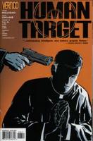
Human Target
I had read good thing about this series and was able to get a full run from #1-21 for about a buck a book. As I have mentioned before, and I’ll mention again, I don’t really read too many new comics. The price is really the biggest factor – as well as the lack of bang for your buck. Honestly, I feel like I can breeze through any modern day comic in under 5 minutes. That’s just not good value for your entertainment dollar. I have resigned myself to at least trying to get the highest quality 5 minutes.

This series has a lot of style and enough substance to make a fan out of me. As I am really only familiar with the character from his 70s days, it was nice not too feel too lost not having read the earlier mini-series and graphic novel. I like the 21st Century version of Christopher Chance – a good mix of brains and brawn. The series gets off to a good, but not great start with Chance in Hollywood – we get a look at his background and motivations, but none of it really interferes with the constantly moving storyline. The 9/11 themed ‘Unshredded Man’ arc came up short in my books. The premise was so fantastic that I feel that an opportunity for truly great story was missed. The next arc, which was baseball themed, was even weaker and I got the feeling that Milligan was using one of Bush’s State of the Union addresses (9/11, Corporate Scandal, Steroids). The series then picks up with #6 – a single-issue story involving a priest. There’s nothing I love more than a good story told within 32 pages, and Milligan and Co. pull it off here. It actually shouldn’t be too hard to make a good, short story considering this was a back-up characters for years. The next arc is also good – involving people hiding from their criminal past. We get to see Chance acting a bit human, which is fun – and we get to see him outwitted, which adds some drama.
All in all, this is good stuff. Even the issues I felt were subpar are very readable. At times, Milligan gets a bit too ‘Vertigo’ with the language – too many F bombs spoil the broth. The artwork is excellent and both of the artists used so far give the title a distinct look. Cliff Chiang's art is somewhat Darwynian, and that works well – especially the way he plays with shadows. I think I prefer Javier Pulido, though, as his artwork – which strikes me as a Alex Toth/Dan De Carlo hybrid – infuses the pages with a kinetic energy that moves the narrative along. I really look forward to making my way through the rest of the stack and discussing my thoughts on the later issues.


2 comments:
Someone sent me... 1 - 14, I think. I enjoyed it quite a bit, and was surprised it didn't catch on.
I really loved this series. It's almost criminal that it sold so poorly.
Post a Comment