Monday, June 25, 2007

Shark Wrasslin' Covers

Long before the release of Jaws, sharks held a special place in the hearts of comic book cover artists. There are plenty of well-known covers out there featuring sharks, especially in titles that regularly feature undersea adventures. There is a whole sub genre (at least there is now!) of covers featuring a typically surface dwelling protagonist going Mano e Mano with a hungry shark.

Shark Wrasslin' Covers were particularly popular in the Golden Age, and perhaps the best remembered example is Lou Fine's cover to Hit Comics #5. Now, none of have ever read these early issues of Hit Comics, but we all know these covers through countless reproductions in Comic Book Marketplace, the Gerber Journals and various Ron Goulart books. OK, maybe this isn't a shark, but it sure ain't a marlin with those teeth. All we know is that it is a Killer Fish, but a very threatening pink underbelly. While it sure looks as though the Red Bee knows how to wrestle this shark, I'm a bit more concerned about those shackles around his ankles. This is the gold standard for Shark Wrasslin' covers.

Perhaps a little less well know, but highly desired by an psychotically obsessed corner of the Golden Age collectors market is Catman #33. LB Cole produced some of the greatest covers of the Golden Age, and his Catman covers are certainly among his best. We've got typically eye-catching Cole colour here, and a fish that certain looks more like a shark than the fish threatening the Red Bee. Catman is looking cool and confident and must be thrilled that he packed his the long knife that morning. Kitten (I am not making that up - that's her name) has the body language of someone out for a morning swim. Perhaps she is simply mesmerized by the school of exotic looking fish, who don't seem to even be the least be fazed by the action to their immediate right.

I've never actually had the pleasure (is that the right word?) of reading a copy of Supersnipe Comics, but from what I can gather, it involves the Walter Mittyesque adventures of a young Jerry Bails. If you've ever scanned the GCD or Gerber cover galleries, you'll know that Supersnipe has some of the strangest covers of the Golden Age, and that's saying quite a bit. This seems to be the same shark that attacked Catman and Kitten, and his looking to feast of swimmers. Luckily, Supersnipe and his tiny, tiny head has arrived just in time to make the waters safe once again. While I like the overall vibe of this cover from kitschy perspective, Messrs. Fine and Cole needn't have worried about losing their livelihoods.

When I first saw this next cover, a couple of questions came to mind. Firstly, what is the Shadow doing wrestling a shark? Second, does he always wear just a bright, white shirt under his cape? Finally, did everyone in the 40s walk around with a knife in their pockets? The thing I like most about this particular covers is that this actually looks like a shark - no pink underbelly, no goofy upside-down smile. Again, we've got a school of disinterested fish, but what I really loved about this particular cover is the fact that the Shadow's fedora didn't pop off the minute he hit the water's surface, but somehow has only been loosened once the shark fight got underway. A great cover that loses a few points due to the presence of the floating heads of the pseudo-Newsboy Legion.

I'll leave you with this cover to Wonder Woman #101. I don't have much to say about it except that upon closer inspection, I'm surprised it managed to get a CCA Stamp. First of all, if it weren't for that little bit of blue showing, you'd think that the Amazon was out for a skinny dip (with shoes, of course). Somewhat related to the near nudity, I am also a little concerned that, in a crisis, her facial expression is one of arousal. Very strange. Perhaps is the ultra-rare Vibrating Shark. Wonder Woman has appeared on more oddball comic book covers that any other character, but this one is off the charts. She obviously really enjoys shark wrasslin'. I hope you did too.

Thursday, June 14, 2007

Single Issue Hall of Fame: Justice League of America #14

The original Justice League of America series is probably best remembered for its multi-issue JLA/JSA crossover and the forgettable seemingly never ending JLA Detroit saga. There are some real single issues gems in the series though, and #14 is my favourite as it is pure Fox/Sekowsky goodness. Of course, it’s the Murphy Anderson bowling–motif cover that catches your eye. Bowling covers are a favourite of mine too, but that’s a whole different story.

Open up this book and you’ll soon find that everything that is so lovable about the DC Silver Age (in all of its implausible goofiness) is present. To a certain degree the actual story is almost an afterthought as the entire premise is to set up a scenario wherein the Atom can prove his worthiness to validate his selection into the Justice League. The JLA is on the ropes as the combination of amnesia and a team of second-string villains (Sea Thief? Doctor Davis?) was just too much for them to handle.

Luckily instead of simply killing our heroes; the mystery villain keeps everyone on ‘pins’ and needles, by packing the Atom into an explosive ball to ‘strike’ the JLA. Luckily, he escapes without a second to ‘spare’ and sends the villain’s plans right into the gutter. Yup – it’s corny, but it’s a lot of fun – and as a bonus we get a surprise twist at the end and a one panel appearance from Superman to satisfy contractual obligations, no doubt.

In the end, we have a nice moment in the JLA Meeting Room as the team shows that it’s willing to go above and beyond to accommodate their new diminutive member. It’s great stuff all around. This story can be found in the DC Showcase Presents Justice League collection as well as Volume 2 of the JLA Archives.

Friday, June 08, 2007

Quick DVD Reviews

Little Miss Sunshine
I had pretty high expectations and for the most part, they were met. It’s a fun little film with just enough pathos to make it stick with you for a while. A vanful of misfits is just a little too much to swallow at times, but the likes of Greg Kinnear, Toni Collette, Steve Carell and Alan Arkin could make Plan 9 from Outer Space an Oscar nominee. It also reminded me how much beauty pageants for kids give me the creeps.
Grade: B+

Stranger Than Fiction
I thought I knew exactly how this movie would play out. I was a more than a little wrong. I was simply expecting some sort of post-modern Charlie Kaufman-lite type of thing, but it proved to have its own voice and I really liked the way it moved along. A lot of understated performances, which was nice as there was a real opportunity to ham it up here with the likes of Ferrell and Hoffman sharing scenes.
Grade: B+

The Queen
Meh. Nice job all around in terms of the performances, but I felt like the story got stuck in a loop for the entire middle act. The whole ‘Will she or won’t she go to London?’ bit ended up being the focus of the entire movie. Plus, the whole ‘Stalkers & Stag’ metaphor was too ham-fisted for my tastes. The whole thing came across as a bit of a Movie of the Week.
Grade: B-

The Prestige
What I liked most about this film, is it actually feels like a smallish 70s flick (think The Duellists), but there’s also a bit of a Hammer Victorian-era setting B Movie thrown in there too. Bale, Caine and Jackman are superb, and the whole film just oozes with atmosphere. The scenes in the U.S. with Bowie are the weakest point, as it all feels a bit slapped on, to help explain the almost inexplicable plot. I didn’t feel that was necessary – a few little mysteries left to ponder wouldn’t have been the worse thing that could happen. All in all, I admired this film because it was mainstream and yet sufficiently different so as to be unlike anything else I’ve seen in a while.
Grade: A-

The Illusionist
Well, it was a pretty damned fine year for movies about late 19th Century magicians. I was concerned that I had rented this one too soon after The Prestige, but the movies could not be more different (well, I guess that’s not entirely true – I guess and animated musical would have been even more different), but it is smaller in scope and delivery. Norton is in full command here – able to utilize his intensity for the first time in a long time. Giamatti wisely lays low but does a nice job as the conflicted detective. Jessica Biel is fine, but fairly wooden - if she picks more projects such as this, she could have an interesting career.
Grade: B+

Friday, June 01, 2007

Single Issue Hall of Fame: Conan #9

The ability to cram an interesting story, full of fully realized characters into a single comic book has nearly become a lost art. Now, I love a good story arc as much as the next person, but there is something magical about a single comic book that contains all of the elements needed for quality 4 Colour entertainment. Over the next little while, I’d like to focus on what I’ve inducted into my own personal Single Issue Hall of Fame. These are book that have been able to excel on all levels within the confines of two staples and one cover. Here’s my first inductee:

Conan the Barbarian #9

I’ve always liked Conan. I stress liked, because I am not one of those people who absolutely loves Conan, as I was never really into the sword and sorcery stuff as a kid, so I really only read this comic sporadically (we are talking early 80s here) and I actually preferred the black and white magazine.

When I began collecting back issues, however, early Conan books were easy to track down and still not too pricey. One of the earliest ones I got my hands on was issue #9, featuring 'The Garden of Fear'. I probably liked it well enough as a child, but I don’t really remember the story staying with me for too long.

I re-read it more recently in one of the Chronicles of Conan volume and was totally blown away. Of course, Barry Smith’s art is engaging and dynamic, but I was most struck by the sense of atmosphere created by the combination of Smith’s art and Roy Thomas’ words. The whole notion of the black winged demon in a tower surround by carnivorous plants had such a great Gothic, almost Lovecraftian feel to it.

As I understand from the afterword to the volume, Thomas adapted this tale from a non-Conan story written by Howard. If found this to be somewhat ironic as I perceive it to be the perfect Conan story. If you have read it, I urge you to seek it out. This is as fine a comic book story as you were likely to find at Marvel in the early 70s – it is simultaneously beautiful and unsettling.

Wednesday, May 23, 2007

Dr. Strangelove Covers

Anyone who has ever flipped through an Overstreet has noticed that certain thematic covers are noted as collectors try to scoop up all of the Infinity Covers (my personal fave) or Christmas covers that they can find.

Lately, I been spotting certain certain trends in comic book covers that are just a little more obscure. Nothing quite like Scott Shaw!'s 'Fish in Face' covers, but still a little off the beaten path. One that I've seen more than a few times, is what I'll call a Dr. Strangelove cover, as a nod to the famous Slim Pickens scene at the end of Kubrick's classic film. Of course, all of these covers predate the movie, but that really neither here nor there.

For a while, during the Golden Age, it was apparently very au currant to draw a superhero straddling a giant rocket, atomic or otherwise. I am not sure if Dr. Wertham even had much to say about this, but it seems to be one of the more Freudian of all comic book cover themes. Let's take a look at a few examples.


The most famous of these is likely Special Edition Comics #1, which was recently redrawn by Joe Simon for an Overstreet Price Guide cover. We are not entirely sure what the Big Red Cheese is doing with this particular projectile, but he's obviously elated. In and of itself, this is a very tough to find and valuable comic, and will only skyrocket in price after the Dr. Strangelove cover genre takes off. If you can tell me exactly what type of bomb that Cap is riding, it means you've been spending too much time on artillery websites.


Sticking with Fawcett, we find another member of the Fawcett family taking a ride on a WMD on the cover of Captain Marvel Jr. #19. As with his colleague, Captain Marvel Jr. also seems to be thrilled to have his legs wrapped around a deadly missile. We are still not in the atomic age just yet, so this one can only do so much damage but as resident of Dresden (and Billy Pilgrim) can attest, enough non-nuclear bombs can make life pretty miserable. Although Mac Raboy is certain a demi-god when it comes to cover design, I do worry about the impact CM Jr. is having on the aerodynamics of this bomb.


Obviously other publishers got their hands on Fawcett's sales figures and decided that the Dr. Strangelove covers the reason behind the success. When it comes to crazy cover adventures, no Golden Age hero comes close to Doll Man (that's a whole other blog entry, though) as can be seen on the cover to the to Feature Comics #50. Now, Doll Man has wrapped his bare legs around many strange objects, but this one likely takes the cake. Again, I'm not really sure what's going here as Doll Man is sailing over the heads of the bad guys. Is he actually saving them by steering it away. Is Doll Man a traitor? Should someone tell Spin Shaw?


Finally, we see a 3rd tier publisher choose the Dr. Strangelove cover as a possible springboard for the coming of a second Golden Age. Captain Flash is perhaps no Captain Marvel, but even he found time to overcompensate for shortcomings in the loin area but hopping aboard an explosive device on the cover to Captain Flash #1. This is almost a retro cover, as it was published in the mid-50s, a decade after the above posters. As it was during the heart of the Atomic Age, the fine folks at Sterling obviously thought that a generic superhero riding an atom bomb would be enough to make them a big player. Of course, Captain Flash #1 isn't exactly Showcase #4, but Mike Sekowsky sure gave it his best with this cover. Here's a question, though - shouldn't a place named Atom City actually welcome atom bombs?

Friday, March 30, 2007

A Second Look - Batman: A Death in the Family

Remember when the death of a superhero was a big deal? Seems like 100 years ago. I recently dusted off my old Death in the Family TPB and tried to give it a look with fresh eyes. My expectations were low, as I had never had much invested in Jason Todd and the whole democratization of storytelling had always rubbed me the wrong way a bit. I also recall thinking that the whole Middle East angle to the story was about as clichéd 80s as you could get.

You know what? I was wrong. The story really isn’t half bad, Jason Todd comes across as far more sympathetic a character than portrayed earlier, there was a good degree of pathos in his search for his mother, and the whole Middle East connection seems pretty topical today. His death – the sheer brutality of the Joker’s beating (much of it kept off-panel), his last minute heroism and the Batman’s reaction are all well present and retain a real impact.

I’ve always found Jim Starlin to be pretty hit and miss as a writer and he’s responsible for one of my least favourite Batman stories ever (The Cult), but he does an ok job here. I get the feeling like he wanted to introduce a bunch of ‘Big Ideas’ and make grand statements, but someone wisely suggested that he focus on the more human element of the story. All things, of course, are made better by Jim Aparo art and this story is no exception. Whenever I see an Aparo cape & cowl, it feels like a homecoming. He is able to convey emotion here, and I couldn’t think of an artist better suite to telling this story. We miss you Jim.


All in all, I think it holds up pretty well. It’s a shame that DC felt it needed a big stunt, and I sometimes feel as though this storyline (along with Crisis) helped to open some floodgates that should have remained shut. That being said, it’s really a pretty good piece of comic book storytelling and made me feel sad for the loss of Jason Todd. That’s quite an accomplishment.

Monday, March 19, 2007

I Heart Heath's Haunted Tank

I know that I’ve written about Russ Heath before, and I’ll certainly write about him again but he’s on my brain right now, so you’re stuck with me chatting about him today. Heath is one of those artists whose work I really love, but whenever the time comes to jot down a list of top 10 or top 20 favourite artists, he just never seems to come to mind for inclusion. OK – that’s a bit of a lie, having reviewed my top 50 artists list on last year’s CBR compilation, I had him slotted at #19.

The reason I don’t often think of Heath is probably because he didn’t work on any of my favourite books when I was a kid, like Aparo, Newton or Dillin and wasn’t a huge factor in the initial wave of back issue collecting I undertook – which focused on the likes of Kirby, Ditko and Toth. Russ Heath just kind of snuck by me – who knows why? I was aware of the name, and must have seen some bits and pieces in reprint form but really didn’t get to know his work until about 10 years ago.

The first time his I really made the connection between his name and his artwork was with his arc on Batman: Legends of the Dark Knight. The arc was called Heat, and it was the way Heath was able to draw a heat wave onto the printed page. I knew the name was legendary, but I’d never actually seen the man at work. I was pretty impressed, as it looked very good when compared to most of the artwork in DC books at the time.

I don’t want to talk about Heath and his whole illustrious career and all that jazz right now. All I want to talk about is how kick ass his artwork looks in the DC Showcase Presents Haunted Tank volume. Most of my previous exposure to the Haunted Tank was through late 70s and early 80s of GI Combat. At this stage, DC’s war books were looking a little long in the tooth, and aside from the nice Kubert covers, they weren’t much to write home about. I had always found the concept of the Haunted Tank to be one of the Top 10 strangest in all of comicdom (that’s saying quite a lot).

I wanted to get my hands on the DC Showcase Presents volume as I pretty much plan on getting all of them. I had low expectations, as I knew this wasn’t a series I loved in the same way that I love Jonah Hex or Unknown Soldier. I am thrilled to report that I was happily surprised by what I’ve read so far. The stories are original and the action moves along at a good clip. The real treat, of course, is the artwork. These war books are renowned for the covers (especially those with the Jack Adler grey tones), but the interiors are pretty great too.

I have been absolutely blown away by the Russ Heath drawn issues. His artwork is so superb that I find myself having crazy thoughts like ‘Awwww, these next few stories only have Kubert art’. Who would have ever thought such thought were possible? Not me, until just last week. His artwork is just that good here.

What makes it so great? It’s the faces. He can paint any emotion with just a few strokes of the pencil. The look of panic in a soldier’s eye, the look of exhaustion in a drooping mouth, the sense of claustrophobia created by a few beads of sweat on a brow. It’s all there, in beautiful black and white. I’ve always felt that Toth’s Zorro comics should be used as a textbook for those studying comic book art. If I was Dean of such a school, I’d like to add Heath’s Haunted Tank to the reading list.

Wednesday, March 14, 2007

Manhunter by Goodwin & Simonson: A Look Back

Here I am wasting perfectly good bandwidth discussing a comic strip that has received more than its fair share of kudos over the years. You may be asking yourself – what more can this moron say about Manhunter that hasn’t already been said? Well, at the very least, I can present my opinions on this series punctuated with quirky Canadian spelling.

I had read most if not all of the Manhunter back-ups at one time or another via various back issues, but when I saw this Special Edition TPB on sale at an LCS not too long ago, I thought that it would be great to have the whole thing in a single package. Due to a heavy work and parenting loan, my quality comic book reading time has been somewhat limited as of late, but I finally did get the chance to dive into this book.

As it turns out, it certainly does lend itself to being read in one sitting. You really get a sense of where Archie Goodwin and Walt Simonson were headed with this character. Although it has been said before, this really is groundbreaking stuff; at least as far as mainstream superhero books were concerned. Goodwin’s obvious love of pulps is apparent here, as our hero operates in the shadows and reveals himself on a ‘need to know’ basis. The storytelling has a great more cinematic approach, as the plot unfolds in a slightly kinetic way, forcing the reader to pay very close attention.

The storyline contains so many great elements (shadowy secret society, clones, serious globetrotting) that we have come to know and love as members of the ‘24/Alias’ generation. In some ways, this storyline was so far ahead of the pack in the early 70s that it doesn’t feel at all dated today. It’s really incredible how much the creative team was able to squeeze into each short back-up tale.

Upon re-reading these tales, there are two things that really strike me today. The first is Simonson’s work here. I know he was pretty new to the industry at the time of the original stories, but he demonstrated that he had his own voice and would be telling stories in his own way. Working with Goodwin, Simonson was able to use some creative layouts that are riveting – they are absolutely Krigsteinesque in spots. The look Simonson have his figures changed over the years – morphing into a Kirby-style chunkiness. I much prefer these earlier, lean figures, as they are able to move more fluidly in the action sequences.

The second aspect of this series that really impresses me is Goodwin’s writing. Of course, he was a wonderful writer but he certainly falls into the ‘don’t know what you’ve got ‘til it’s gone’ camp. At a time when the likes of Roy Thomas and Don McGregor were demanding larger and larger word balloons, Goodwin was able to convey a wonderful story in surprisingly few words. It’s an impressive feat.

The really great surprise in this reprint collection, which I understand won some awards upon in initial publication, is a short, silent ‘final’ Manhunter story that provides some closure regarding the clone issue. It a fun little spectacle, based on notes left by Goodwin. Although it has been applauded time and time again over the past 30 years, I just thought one more voice of praise couldn’t hurt. Thanks Archie and Walt – it was a great ride.

Friday, March 02, 2007

Lee Elias at Harvey: Babes, Bullets and Blechh!

Time and time again, we read that the comic book industry had a tough time in the 50s. The advent of the Comics Code Authority coupled with new distraction for youngster such as television made it tough for many companies to find an audience (RIP EC, Quality and Fawcett).

The downside to all of this doom and gloom talk is that many companies were producing comics of a quality that hadn’t been seen to that point and haven’t been seen since. Much of this is due to the amazing roster of talented artists who worked in the industry during the decade. The EC bullpen is certainly the most (in)famous, which superstars such as Craig, Ingels, Cradall and Davis. It could be argued that the Atlas bullpen was just as strong featuring Joe Maneely, Russ Heath, John Romita and Don Heck. Some people may think that DC produced mainly bland comics in the 50s but anyone who has ever read ‘Greatest Comics of the 50s’ has be amazed by the artwork by Frank Frazetta, Ruben Moreira and Alex Toth.

One company that is almost always forgotten in all of these discussions is today best known for friendly ghosts and rich kids with huge heads. I’m talking about Harvey, folks. For my money, Harvey produced some of the finest comics from the late 40s to the late 50s. They may not be known for superheroes, but they published many excellent titles in the Horror, Romance and War genres. Harvey had its own bullpen of fine artists and although they may not be as well known as those who worked for EC or Atlas, they are worth spotlighting. It almost impossible to pick up a Harvey book from this period and not be impressed by the artwork. You’re likely to come across work by such greats as Bob Powell, Rudy Palais and the artist featured in this blog entry: Lee Elias.

Lee Elias may be best know to many fans as the guy who worked on some wacky DC characters (like Ultra the Multi-Alien), or whose name pops up in the occasional oddball Marvel title of the 70s (see Human Fly). Elias actually has one of the longer curriculum vitaes in comicdom. A quick search on the GCD shows that Elias’ first work pops up in the early 40s on Fiction House titles such as Wings, Rangers and Planet Comics. Elias really began making his mark as the lead artist on Black Cat.

Black Cat had been around for years, making appearances in Pocket Comics and Speed Comics. Her adventures were great (drawn by Powell and Joe Kubert, among others) but the stories were brief and hamstrung by WW2 patriotism. In her solo title (still a fairly novel idea that a female superhero could headline a book), she was infused with a mixture of style and energy by Elias’ wonderful artwork. Like so many of his generation, the influence of Milt Caniff is undeniable, but Elias seems to add an extra level of excitement, as his figures seem to be in constant motion. The Black Cat artwork featured here is a good example of what Elias brought to the time; it was exciting and yet elegant.

Of course, with superheroes going out of vogue towards the end of the Golden Age, artists needed to find work in other genres. Luckily for Elias, his skill set was adaptable to almost any genre. Check out the romance page I’ve included here. We’ve got a typical yarn about a girl who falls in love with a rich guy only to find out he’s so rich. Elias is able to work wonders considering his artwork is threatened by the text throughout the story. It’s incredible to see how he manages to squeeze some dancing, a drive in the country and a moonlit paddle into a single panel.

To help serve as a counterbalance to its countless romance titles, Harvey also published a myriad of war books. These are often ultra-violent and not terribly sympathetic to the Communist cause. From time to time, though, a story would be told on a smaller scale - a ‘one man’s war’ type of tale. Lee Elias excelled at these, as he was able to bring both quiet and chaos into a story. Check out the original art war page I’ve included here (I tracked down some online images, thinking that his lovely work would really shine in black & white). It is a tale told simply, yet effectively. There is a real sense of danger and dread here.

To cap off this short discussion of Lee Elias’ work for Harvey, how can I possible leave out the horror stuff. Sure, EC horror books are the most famous – they have been reprinted endlessly and have spawned a TV series, but many of the most famous, and graphic, images from the horror genre actually come from Harvey titles, many of them drawn by Lee Elias. Face Melting Cover? Elias. Exploding Face Cover? Elias. Branding Cover? Elias. The list goes on and on. For some reason, this gentleman who drew such lovely romance stories could also draw the most disturbing covers imaginable. I’ve including my favourite here. For my money, no other horror cover from the 50s comes close to this one in terms of making your skin crawl. Ugh, Rats! Blechh!!

So that a quick look at one of comicdom’s often overlooked creators. Golden Age Harvey books are a relative bargain when compared to those by Timely/Atlas, DC or EC so I urge you to check them out.

Tuesday, February 27, 2007

Quick Book Reviews


The Grand Slave Emporium: Cape Coast Castle and the British Slave Trade
William St. Clair

This fine and concise book by William St. Clair focuses on the life of one specific building; Ghana’s Cape Coast Castle, which I was fortunate enough to visit back in 2000. St. Clair examines all facets of the Castle and debunks many myths. The focus is, of course, on the role of the Castle as a facilitator for the slave trade and St. Clair paints a vivid picture of all of those involved, from the ships’ Captains to the local tribal Chiefs to the slaves working in the Castle itself. The most striking aspect of the trade and life at the Castle, as portrayed by St. Clair, is the sheer normalcy of it all. Overall, it is an impressive piece of work and St. Clair’s writing style has a sufficiently loose feel to it that will engage most readers.

There are some problems, though. First of all, the discussion of the outgoing slaves and their life at the Castle is only briefly discussed. I certainly would have expected more, but this is perhaps because most of St. Clair research is based on the Castle’s archival documents and very little about the slaves was likely recorded. I would have also have liked to see more discussion of the Castle’s history post-1850 or so as that is only briefly touched upon. It would have also been helpful to provide a brief overview of local tribes and geography to provide context. Related to that point, some political context was needed to makes sense of certain events such as the Asante War of the 1870s. All in all, it is an excellent work and highly recommended for anyone interested in the Trans-Atlantic slave trade.

The Inheritance of Loss
Kiran Desai

The 2006 Mann Booker Prize winner. This novel has a dreamlike feel to it, as the reader is transported to northern India in the foothills of the Himalayas. We are introduced to each character slowly and their personalities and motivations are revealed as certain political events transpire around them. All of the is counterbalanced by a subplot involved one character searching for the American dream in a series of below minimum wage kitchen jobs. Many big issues are raised in these pages, including the clash between colonial sensibilities and the modern Indian identity is ever present, but ultimately no resolution is reached. It’s lovely but a little rudderless – a collection of arias rather than a full opera.

Wednesday, February 21, 2007

Notes From the Boob Tube

I don't want as much TV as I once did. That's a good thing. There's still some decent stuff on there, though. Here's what I've been watching:

My Name is Earl
I was a pretty big fan after Season One, but had doubts that they could keep the momentum going into Season Two. I’ve often found that high concept stuff runs out of gas when the writer can’t find new use to take advantage of the gimmick. I guess this ‘crossing things off the list’ thing has legs though, as Season Two has been better than Season One. Of course, some shows are stronger than others (the “My Name is Randy, My Name is Joy etc…” episode is the highlight so far), but even the weaker episodes have a few good laughs. The interaction between Joy and Marlee Matlin as her lawyer is beyond funny.

The Office
The highlight of my week. Is that sad? I don’t actually think so. I am of the camp where I enjoy both the British and American versions, but I honestly laugh out loud much more with Michael, Dwight & Co. I never thought that a TV show could come up with a line as good as Phyllis’ “It says ‘bushiest beaver’” from Season One, but there has been plenty of jaw dropping humour this season. At the conclusion of each episode, I have a sense of dread that this is all too good to be true and the cast will all start to exit for other projects, and we the viewer are left with a bit hole in our hearts. Nothing on TV makes me nearly as happy as this show.

Ugly Betty
They had me from the start – it was nice to see a good fish out of water story on TV. The thing is, after a few episodes it began to feel like a bit of a skipping record. We have so many job switches, cliffhangers, controversies and bits of stunt casting that you’d think this show had been on the air for 5 seasons. While those kind of tricks may keep things moving, they don’t do much for character development. I’m watching out of habit now, but it’s on the verge of being dropped from my viewing rotation.

Studio 60 on the Sunset Strip
Would you think I was shallow and anti-intellectual if I said I was more intrigued by the behind the scenes drama of a late night comedy show than those at the White House? That’s kind of where I’m sitting now. I hope this show is able to survive as it maintains a pretty high quality and it’s nice to have something other than a procedural or reality TV in an hour-long format. The cast is strong – I am particularly impressed by Amanda Peet (not just a pretty face) and Steven Weber. The thing is – Aaron Sorkin is Aaron Sorkin. He writes what he knows and as such, it gets a bit repetitive. Sometimes I feel like this show is so close to Sports Night that I keep wondering when Benson will show up. Still, I’m pulling for this one but I don’t know that I follow it religiously.

30 Rock
The Bizarro Studio 60. I cringed through the first episode. I don't know what I was expecting, but it wasn't that. Everything seemed wrong - flat jokes, bad pacing etc... I was certain that it would implode within a month. I felt for the cast as there is plenty of talent on the show, it just didn't work. What happened next? It got better. A hell of a lot better. The show developed its own style, its own identity and hits a level of absurdist humour that you cannot find elsewhere. Now, it's the funniest thing on TV other that the Office. What a comeback. This is great stuff and Alec Baldwin seems to be having the time of his life.

Amazing Race All-Star Edition
The Amazing Race is the one network reality show that I’ve stuck with through the years. Maybe it’s the wanderlust filled traveler in me, but I love seeing other parts of the world and I really love to watch people struggle to communicate (speaking English with a Spanish accent isn’t the same as speaking Spanish people!). I’ve watched every year since Season 2 (except the Family Edition, which I bailed on) and I was pretty impressed with the All-Star teams on paper – seemed like a decent combination of personality and skill. I was wrong. After only one episode, I am ready to strangle about half of the teams. There are 3, maybe 4 teams who can win this them without an intervention of God (or the producers) – let the others get booted in a massive elimination.

Property Virgins
Really only of interest to snoopy people who follow the Toronto real estate market (like me!); this HGTV show is a blast. The host is a no nonsense real estate agent who loves to give first time buyers a dose of reality (“So that’s the kind of house you like? Too bad – you can’t afford it”). The agent picks 3 homes in the couples’ budget and they tour each of them – surprisingly most couples end up buying one of them (I’d recommend checking out more than 3 houses before buying). If you watch closely enough, you can actually see the couples’ dreams vanish into thin air. It’s fascinating to watch expectations lower to the point where they settle for a hunk of junk in a neighbourhood they would never have considered. It’s great stuff and I’m hooked.

Friday, February 09, 2007

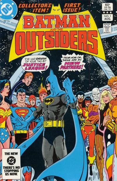
Memoirs of a Bronze Age Baby: Batman and the Outsiders #1

There are some events in comic book history that exist as major milestones on a personal level, but not resonate the same way across the industry. The appearance of Batman and the Outsiders #1 on the racks was a major event for me. This was not simply due to the fact that it was a new title with my favourite characters as headliner, but also because it was conclusive proof that my favourite title (Brave and the Bold) was dead. I was on 9 years old at the time, so I did not really full appreciate the ins and outs of the industry. To my mind, a comic book title was still alive and well until it stopped showing up at the store.

Although I was sad that the B&B was gone, this cover certainly grabbed my attention and raised my hopes. At that stage in my life (I was 10 years old), I’d have followed Batman anywhere. Although, I don’t think the series ever got close to the level of Brave and the Bold, it got off to a very strong start here. We see the classic Aaparo Batman, intent on rescuing his friend Lucius Fox. When the JLA turns him down, Bats heads out on his own, with a little help from Black Lightning. The scene where Batman resigns from the JLA is still one of the best ‘Batman tells Superman to go fly a kite’ moments of all time.

The supporting cast is introduced slowly, we know Black Lightning and Metamorpho, but there’s plenty of mystery around Katana, Halo and Geo-Force. There was so much to love about this issue, so much potential. At the time, it seemed like such a watershed moment – but I can see now that I was just a silly kid who thought this was the next JLA. Can you blame a guy for Jim Aparo would keep drawing Batman forever?

Thursday, February 01, 2007

TwoMorrows Reviews Today!


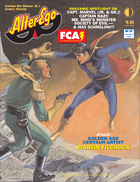
Alter Ego #64

I’ve been finding this mag (to which I’ve subscribed for 3 years or so) to be a bit hit and miss lately – for every interesting article on some nearly forgotten comic book creator, there’s something that just does not interest me. This particular issue is no different.

There’s quite a bit that I enjoyed: the overview of the Monster Society of Evil should please most Fawcett fans and the short article on Bud Thompson was a pleasant surprise as he is someone about whom I always wanted to know more. On the downside, however, the whole ‘Timely Pin-Up’ business seemed cute the first time around, not so much these days. The flashbacks to the 1966 convention were initially fairly interesting, but I find them to be tiresome now and I’d rather reading more creator profiles. All in all, I enjoyed this issue – but I don’t think there’s much there to attract a non-Fawcett fan.

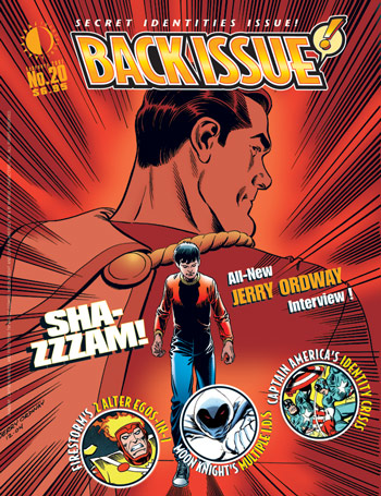
Back Issue #20

When Back Issue was initially launched, I was a bit of a naysayer as I didn’t really see how it could replace with TwoMorrows had lost in Comic Book Artist. I was also in a particularly bad mood as that was around the time Comic Book Marketplace was cancelled. I was wrong, and I am a now a subscriber. The good people have followed up the stellar Don Newton issue with another great one with a superb mixture of features.

My attention was automatically grabbed by the Englehart/Buscema interview about Captain America’s post-Secret Empire soul searching. I was so impressed with Englehart’s praise of our Pal Sal’s artwork that I fired him an email. He responded promptly with even more praise! It’s nice to know that underappreciated artists like Sal are admired by their peers.

This issue also has a great piece on the origins of Firestorm and how can anyone not love a mag that is willing to dedicate a half-dozen pages to the Human Fly? You cannot find this stuff anywhere else, folks. My only criticism of Back Issue at this stage is that I wish they would widen their mandate to reach further back into the past. There are still plenty of creators who work pre-1970 around to give interviews – let’s talk to them before it is too late!

Friday, January 19, 2007

Stale Movie Reviews

Here's some movie reviews for those of you who haven't left the house (or ordered PPV) in a year or so:

Prairie Home Companion
I have only appreciated what Keillor & Co. have been up to all these years from a distance. I’ve seen little bits here and there on PBS, and read at least one of his books (Lake Wobegon Days, IIRC). This movie is odd – and I am not sure if that’s in a good way or a bad way. It has a timeless feel, but that become confusing at a certain point. I had a hard time believe that Kevin Kline’s character could exist in the same world as Lindsay Lohan’s character. I know it’s a movie and I am supposed to suspend my disbelief, but it just didn’t all fit together for me. Perhaps it was the performances – at times, it came across like Keillor acting as ringleader the to Hollywood All-Stars who were all attempting to out-ham each other. I don’t want to leave you with the impression that I hated this movie – as that is certainly not the case, but I can’t honestly say that I really like it either. I am ambivalent about it, and I’ve never felt that way about an Altman film before.

Grade: C+

Casino Royale
With a 13-month old at home, my wife and I don’t get out to too many movies. When we do get the chance, we prioritize. We decided that one movie we needed to see on the big screen was Casino Royale. When Daniel Craig was announced as the new Bond, I felt sorry for him. The backlash was unbelievable. Anyone who had seen Layer Cake knew that he had more than enough charisma to carry a Bond film. If you can cheer for a drug dealer, you are certainly going to cheer for Bond. This is a fun, fun film – which is a challenge, because it’s probably the flimsiest plot of any of the Fleming novels. Out of necessity, style has to overcome substance in parts – but that works. We’ve got a ‘Old School John Woo meets JJ Abrams’ thing going here, and I like it. Craig and Eva Green radiate and the supporting cast is sufficiently exotic to compensate for any stiffness. My biggest complaint is Judi Dench’s uncontrollable scene chewing. A perfect film? Nope, but it’s a lot of fun.

Grade: A-


The Break Up
How did this one make so much money? I just don’t get it. I actually had hopes that it would be good for a few laughs, as we’ve all been through some petty fights with significant others. I actually like both leads – but I’m starting to think it’s a ‘small doses’ kind of thing. The real problem, however, is the writing and directing – it just comes across like a compilation of scenes with little or no linkages, many of which are in needs of a rewrite. I’d write more about this one, but I have already forgotten most of the movies – never a good sign.

Grade: D

Borat: Cultural Learnings…
The first movie my wife and I had seen in theatres since the birth of our child. Does that give you a sense of how much we were looking forward to it? I must say – it lived up to our hopes. Of course it’s over the top, of course some people were perhaps misled just a little and of course not every American is a gun-toting racist. Actually, what this movie leave you with is a sense of just how willing many people are to help out a stranger, and how tolerant they will be of his lunacy. In the end, it was worth it to get out and laugh harder than I’d laugh in ages. Even the movies weakest point (the overly long nude fight) was salvage by SBC’s speech at the Golden Globes.

Grade: B+

Monday, January 15, 2007

#1 - Top 12 Comic Book Characters

1. Batman

My first, my last, my everything.

This will be the shortest post I’ve made for the 12 Days, as it is extremely difficult for me to sum up what Batman means to me.

He is at #1 because he is more important to me than numbers 2 through 12 combined.

The best way I can explain it is as follows:I could not live with a comic book world that did not include Batman, but I could live with a comic book world that had only Batman.